
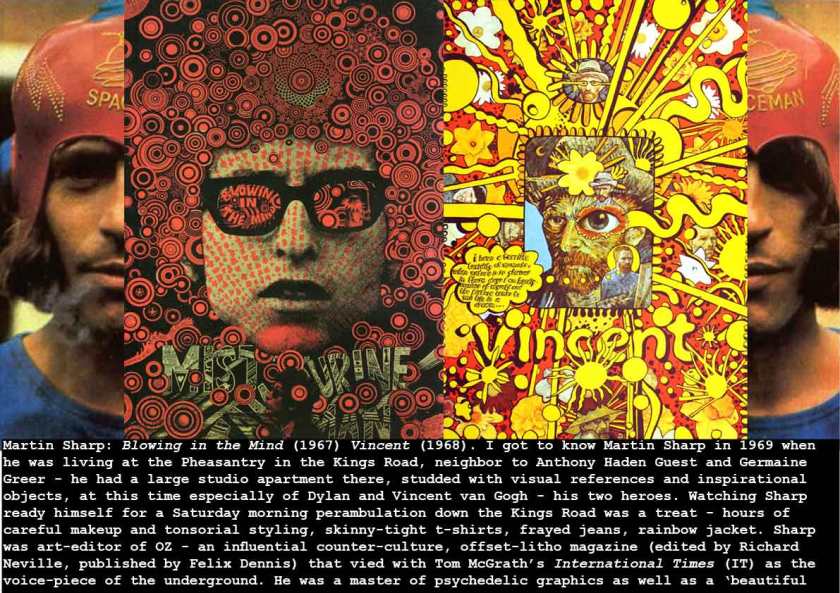
The late Martin Sharp needs no endorsement from me – his work is celebrated now even by the ‘straight’ graphic design institutions who ignored him then – but I still want to write an appreciation. His iconic posters covers for OZ magazine and his album sleeves for Cream (Disraeli Gears, and Wheel of Fire), made him world famous, as well as a focal point of the London underground scene. His artwork is created using a range of techniques – some newish in the 1960s – like flourescent paints and inks, cheap Xerox copies, Letraset and Letratone (rub-off Ben Day tints) – but Sharp’s essential talent was in his draughtsmanship and his drug-fueled imagination. Anyone who had taken acid on a tiny bit of blotting paper around this time could recognise and identify with Sharp’s brilliant mixed-media photo-montage. He was completely unafraid of appropriation and mixed photographs by his friend Robert Whitaker (The Beatles photographer), colour prints of art from the past, ideas from Escher, Muybridge, speech bubbles from comics, word-play and psychedelic colours to create piercingly appropriate image/mandallas of the then present.
In his wikipedia entry, Sharp in quoted on his Disraeli Gears sleeve:
“Some of the ingredients in the cover are made up from Victorian decorative engravings. It was done in black and white first and then painted with fluorescent colors. I tried to capture the warm joyful liveliness of Cream’s songs. I later went on to design the cover for “Wheels Of Fire” for Cream and also for Ginger Baker’s “Airforce”, a band called Mighty Baby…Jeannie Lewis’ “Free Fall Through Featherless Flight” and a few of my own releases of Tiny Tim, “Chameleon”, “Keeping My Troubles To Myself”, and “The World Non-Stop Singing Record.”
see also: Michael Organ: http://sixtiessharp.blogspot.co.uk/
