John Brunner 1968-1975

Half a decade before cyberpunk, Brunner explores the frontiers of science fiction – and the emerging territory of cyberspace – with his The Shockwave Rider (1975). Vernor Vinge follows with his masterly True Names in 1981, and Gibson with  Neuromancer in 1984. This is the chronology of cyberpunk as seen from this side of the ocean.

This is the cover blurb from The Shockwave Rider (vintage 1975): “Nickie Halflinger, the only person to escape from Tarnover – where they raise hyper-intelligent children to maintain the political dominance of the USA in the 21st century – is on the run, dodging from loophole to crevice to crack in the computerised data-net that binds the continent in chains…”

And from Brunner’s prefatory acknowledgement:

“People like me who are concerned to portray in fictional terms aspects of that foreign country, the future, whither we are all willy-nilly being deported, do not make our guesses in a vacuum. We are frequently – and in this case I am specifically – indebted to those who are analysing the limitless possibilities of tomorrow with some more practical aim in view…as for instance the slim yet admirable hope that our children may inherit a world more influenced by imagination and foresight than our own.

The ‘scenario’ (to employ a fashionable cliche) of The Shockwave Rider derives in large part from Alvin Toffler’s stimulating study Future Shock, and in consequence I’m much indebted to him.”

From Brunner: The Shockwave Rider A Methuen paperback 1975.

Victor Papanek 1971

There was a kind of cultural phase-shift triggered by the first photographs from NASA satellites and manned orbits showing the whole Earth floating in infinite space. Although Gherman Titov – the second Russian astronaut to view the Earth in this way – had taken a partial monochrome Earth from space in 1961, it wasn’t until the famous ‘blue marble’ shots taken from the NASA ATs-3 Satellite in 1967 that the coloured beauty and isolation of our planet became iconically obvious.

earth_NASA-1024_c

It was this image that inspired Stewart Brand to set up the Whole Earth Catalog in 1968, and triggered the foundation of the Greenpeace and Friends of the Earth environmentalist movements. The publication of this image also coincided with the beginning of the construction of a  large-scale simulation of the Earth and its resources commissioned by the Club of Rome, using Jay Forrester’s World Dynamics (system dynamics) model (published as ‘Limits to Growth‘ in 1971). Furthermore, Richard Buckminster Fuller’s World Game idea was published in 1971 (World Game Series Document One: The World Game: Integrative Resource Utilisation Planning Tool, 1971). These events framed the publication of Papanek’s Design for the Real World.


See Fred Turner: From Counterculture to Cyberculture 2006


Gene Youngblood 1970

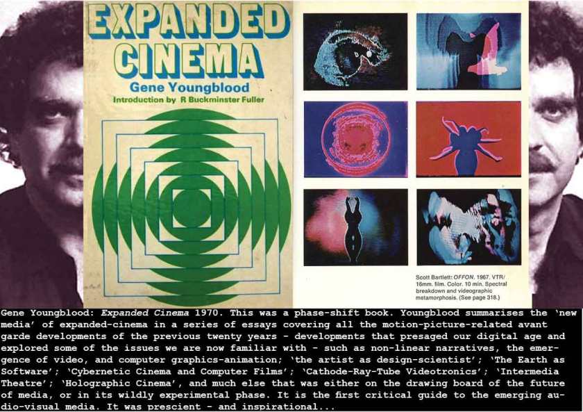
In the light of 21st century media developments (you know what they are), Youngblood’s 1970 book reveals its lasting importance. It was a blast for us multimedia geeks at the time – the first proper art-critical-historical work that I had come across that recognised this most interesting fusion of art-technology-cinematic – digital media that I was just glimpsing through student work at Portsmouth and Hornsey. In 1967, I’d collaborated on a fringe degree show entitled Krystal Klear in Warp Drive, with Gary Crossley, John Czaky and Bob Blagdon – it was a multi-screen installation with 4-track stereo, timed carousel slide projections, 8mm film – a very loud sound-track mixed from the Ronette’s Walking in the Rain with sound effects of NASA Saturn 5 Rocket launches and other stuff – we aimed for a sensory bombardment that matched our enthusiasm for this new mix of media. I went on for a post-graduate year at the Light/Sound Workshop at Hornsey College of Art (1968-69) where we were experimenting with just the fusion of audio-visual media that Youngblood was investigating in Expanded Cinema.

Youngblood surveyed developments that created this territory, and impacted upon the range if motion-image arts and tools that were just newly appearing (or being freshly examined) – computer graphics and animation, multi-screen projections, analog and digital computing, performance art, computer-generated sound and poetry, music-art synaesthesia. This was a new language that talked the talk of the zeitgeist. We were hooked.


Stewart Brand 1968-1973

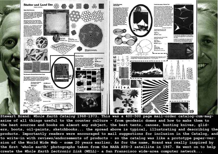
As I suggested above, the Whole Earth Catalog was really my generation’s social media and world-wide web. That it came from a similar altruistic perspective to that which underpinned the Internet and the Web is explained in Fred Turner’s excellent From Counter culture to Cyber culture – Stewart Brand, The Whole Earth Network and the Rise of Digital Utopianism (2006). This was the catalog of ideas, of products, of books, of people – that brought us all together. It kick-started environmentalism as a counter-culture concern (Friends of the Earth and Greenpeace were formed in the next few years), and as Fred Turner explains, it was the organ of techno-optimism – the first pages were devoted to Buckminster Fuller. It was one of the first of the underground publications that promised real world-change. And as Turner points out – it was commercially successful too – “Over the next three years, the Whole Earth Catalog and the Supplement grew exponentially, and so did their audience. Before they announced that they would cease publication with The Last Whole Earth Catalog of 1971, Stewart, Lois and a growing staff produced six different semiannual editions of the Catalog, of which some 2.5 million copies were ultimately sold.” (Turner pp81).

The counter-arguments to the kind of techno-optimism evangelised by Brand are to be found in Theodore Roszak’s From Satori to Silicon Valley (1986), and Where the Wasteland Ends (1972).


Ronnie + Ray Foulk 1969

Pop Festivals were a post-World War 2 phenomenon, begun in the 1950s with the Newport (Rhode Island)  Jazz Festival (1954). In Britain this was reiterated by Lord Montague in the Beaulieu Jazz Festival – famous for its bohemianisms and mock-altercations between trad ravers, rockers and teds. So when the Foulks began to plan their own ‘South Coast Bank Holiday Pop Festivity’ these were the main models. Pop Festivals were as yet largely ‘monomedia’ events – obviously focussing upon music performance. What we tried to do at the 1969 Dylan festival was to introduce poetry, folk-music, art-events (Graham Stevens and his pneumatic art installations – the first inflatables as art pieces – and the foam events so seized upon by International mass media (The Paris Match did a major spread and full-colour cover of these mountains of semi-nude teenagers covered in soap-foam. Of course the Dylan festival (like other festivals to come) rapidly acquired its own character and its emergent art forms – Desolation Row (- an avenue of tents, teepees, camps, huts and other makeshift dwellings) was the main home-grown ‘installation’ that became a photogenic representation of Dylan’s famous song – and much shorter-lived, the foam-human be-in was as spontaneous and as fun as a party dance.

See: Ray Foulk: Stealing Dylan from Woodstock 2015

See also Cedric Price + Mick Farren: Phun City (1970)

1969_paris-match-IOW-festival_c


David Hillman 1970

I was an enthusiastic but  rank amateur when I first met David Hillman – it must have been in 1969. I was working together with Chris Robbins, a journalist/writer friend of mine, on a project that we tentatively called Canned London. It was a boxed portfolio of examples of life and art in what Time Magazine had christened ‘Swinging London’ a couple of years earlier (April 1966).

Canned London featured an airbrush illustrated  poster by Alan Aldridge (creator of The Beatles Illustrated Lyrics (1969) ; Poems by Christopher Logue (Red Bird Dancing on Ivory – Jazz-Poetry, 1959); a portfolio by Clive Arrowsmith (art/director of Ready Steady Go and photographer for Nova) and other London photographers; articles on the Marquee, Speakeasy, Ponte Vecchio, and other clubs and restaurants; fashion pieces, (etc). Financed by Andre del Amo – a millionaire friend of Chris – we had set up a design-publishing group called Factory, and printed a cool computer hand-drawn OCR-A-like letterhead. We wrote to Hillman  at Nova and asked for a meeting. We wanted him to art-direct the project. Thinking we were from Andy Warhol’s Factory (which then we hadn’t heard of!), he gave us an interview, and despite our callow inexperience he was very supportive. About 20 years later, I was pitching a book to Phaidon (Understanding Hypermedia, 1993) and David Hillman was supervising art director – it was he who suggested Malcolm Garrett as the designer – a fortuitous and happy suggestion as Richard Oliver and I became great friends with Malcolm.

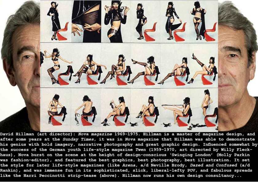
I love Harri Peccinotti’s serial strip-tease – treading that fine line between risque and cool – it was styled by Anthony Price and featured trans-luvvie Amanda Lear, and rather tritely entitled How to Undress in front of your Husband. – I’ve shown just one third of a gatefold spread. The beautiful (Panton S) chair is designed by Verner Panton in the mid-1960s.


Neil Armstrong 1969

This photograph, together with the early ‘whole Earth’ images of 1967, was transformative. Here we have possibly the ultimate expression in human terms of where we were at in scientific exploration, space and media technology, and what Tom Wolfe described as the Right Stuff of human aspiration, courage and ability. Here’s this snap-shot of the second man on the Moon, standing on a crumbly alien surface already showing the footprints of this ‘giant leap for Mankind’ – and its brilliantly composed (framed in the 2.25″ square Hasselblad viewfinder) – in sharp, atmosphere-free space, lit by direct sunlight. In a period marked by iconic images of man’s failures – starvation in Biafra, massacres at My Lai, the mass murders of Charles Manson – at last we had an iconic image of our success.


see

Tom Wolfe: The Right Stuff 1979