1920-1930
(work in progress…)
The First World War was a defining watershed – not just in political nationalism, militarism and colonialism, but in culture too. If modernism was a cultural rumour before the war, it was a full-fledged saga afterwards. The War spawned the nihilistic, anti-bourgeoise, anti-art movement of DADA; it coalesced the Russian constructivists, catalysed the De Stijl group, marked the maturity of the German Expressionists, strengthened the Futurists, spawned the Vorticists, matured the Cubists. When El Lissitzky wrote and designed his Isms of Art in 1924, he was looking back over two decades of revolution in the arts, revolutions that had been accelerated by the Great War.
Meantime, the Cinema had produced its first grand masters – Melies, Porter, Griffiths, Linder, Chaplin, Vertov, Eisenstein, the Fleischers – and cinemas were now in every town and city; radio had become a mass broadcasting medium for voice and for music; colour photography (in the form of the beautiful Autochrome) had become if not commonplace, then no longer rare. Art and other books featured full-colour reproductions in gravure or CMYK trichromatic halftone plates; magazines and newspapers now universally carried halftone reproductions of photographs; recordings of popular music were widely available on cylinder or on disc; breakthroughs in atonal and other non-classical serious music were progressing apace; Diaghilev had transformed dance with his multimedia, modernist Ballets Russes; the War had introduced modern propaganda – from the recruitment poster to the Agit-Prop train, from the patriotic song to the War Bond concert, from the news-reel to the radio programme. The growth in popular music, catalysed by the Radio and embodied both in sheet music and in records (cylinders and disks), fuelled radio advertising, invented the soap opera, and made into mass media the comedy and variety shows that populated the music hall. The 1920s were soon dubbed the Jazz Age (we saw the emergence of New Orleans (traditional) jazz, the Country Blues and Gospel music), and the Roaring Twenties – in the USA marked by the prohibition of alcohol and the gangsterism that prohibition had fostered. And we saw the emergence of the Star system, the maturity of many different film genres – and the experimentation with film by artists and photographers (like Leger, Charles Sheeler, Duchamp and Man Ray).
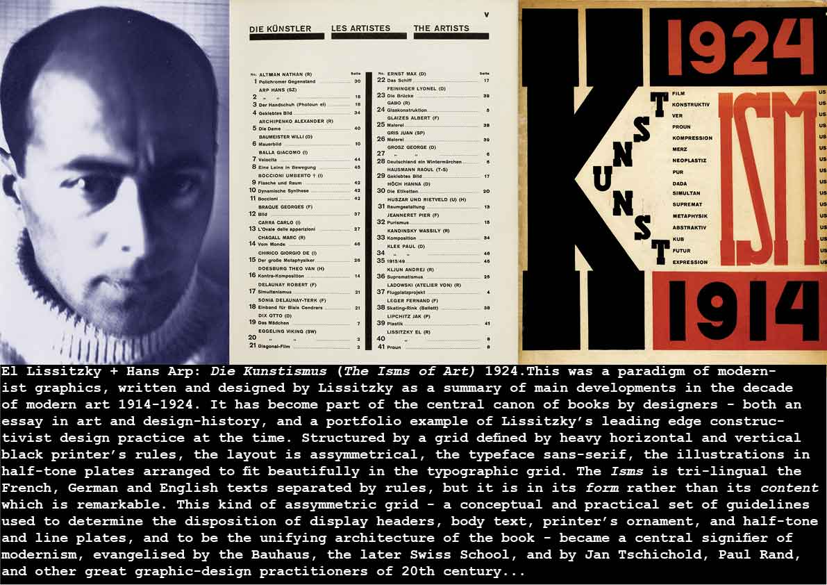
El Lissitzky: Die Kunstismus (The Isms of Art) 1924
The future of Art in the 20th century was being defined – at least in outline – in the period before 1924 – from the hard-edged reductivist abstraction of Mondrian, the conceptual anti-art of Duchamp, the revolution of Cubism from Braque and Picasso, the Expressionism of Kirchner, Macke, Klee, Kandinsky and Munch, the painterly colour of Matisse and the Fauves, the dynamic of Futurism (etc,etc) – all these isms would suggest and indicate the many pathways of art explored later in the century. The great developments of the 1930s and 1940s – Surrealism, Abstraction and Abstract Expressionism – added to the art map, which was also being expanded by the new media of photography (in pictorialism), the cinema, the theatre, the abstract film, the new music, new materials and industrial techniques, new art and design education, and much more.
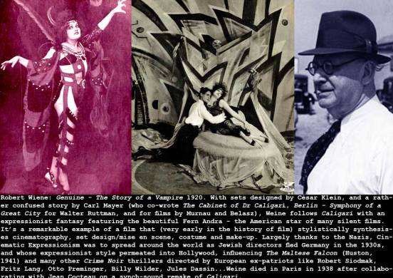
Robert Weine: Genuine 1920
Otto Dix: The Skat Players 1920 + Match Seller 1920

F. Scott Fitzgerald: This Side of Paradise 1920
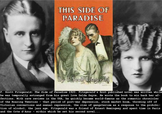
By the time I read Fitzgerald (in the early 1960s), the idea of the Roaring Twenties was already history, hinted at in the TV series The Untouchables (1959-1963) that followed the glamourised adventures of Elliot Ness and the FBI in their war on organised crime). You could still buy original Twenties clothes (men’s pinstripe suits, dinner jackets, tweed sports coats) women’s tasseled flapper dresses) in jumble sales and the vitally important (to an impecunious art student) charity stores – the Twenties was only a generation away. But then reading Fitzgerald, you discover that his projected model of what the Twenties would be like, and how it would be characterised by history, was already fully formed (in 1920!). Sure it was an insider’s vision from the perspective of a wealthy, almost aristocratic, subset of society, but it was still remarkably prescient. And the romance, the style, the glamour…
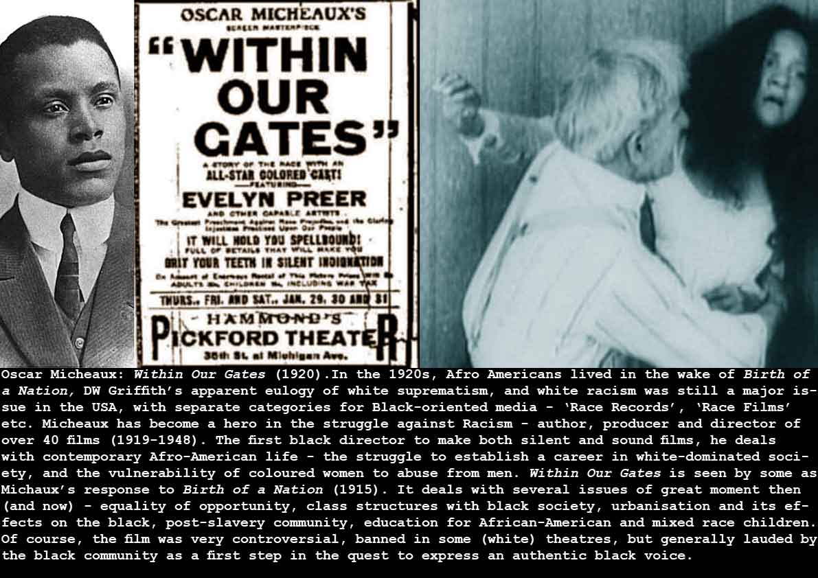
Oscar Micheaux: Within Our Gates 1920
Lewis Hine: Steam Fitter 1920.
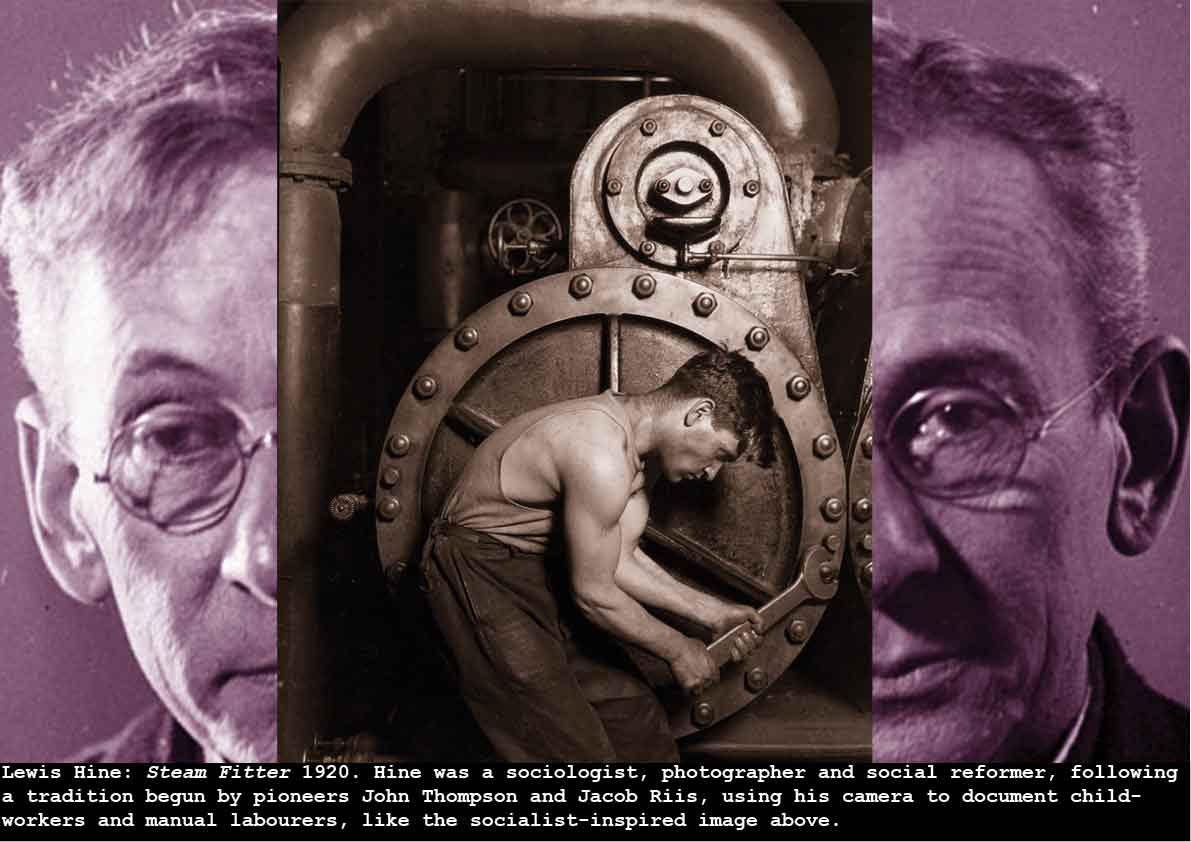
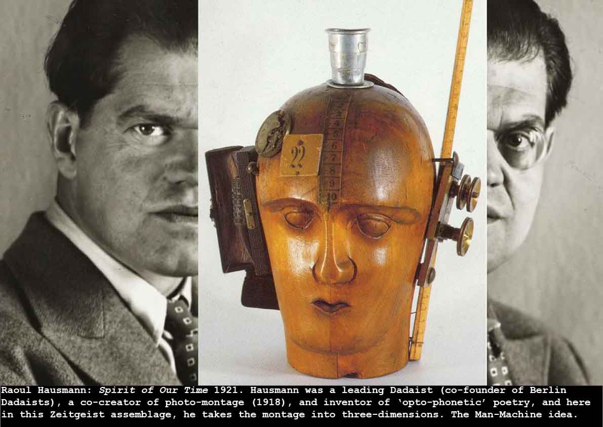
Artists and writers in the 1920s were quick to recognize the emerging man-machine dialectic – with increasing mechanisation, now amplified by Henry Ford’s production line manufacturing techniques (from 1913) – and amplified by the massive industrialism embodied in the War. The Czech Karel Capek produced the first play about robots – while incidentally coining this word (and so beginning a whole sub-genre of science-fiction. But Lewis Hine pinned the issue in this iconic photograph – a man servicing an enormous machine – a prescient vision of man’s role in industrialised, society – the same heroism in both capitalist and communist cultures. Charlie Chaplin was to provide an acerbically comic take on this duality in his Modern Times (1936), and in DADAesque sculpture it is Raoul Hausmann who symbolizes it perfectly in Spirit of Our Time (1921) – the head of a tailor’s dummy made into a robotic head.
Kurt Schwitters: Merz 163 (with Woman Sweating) 1920
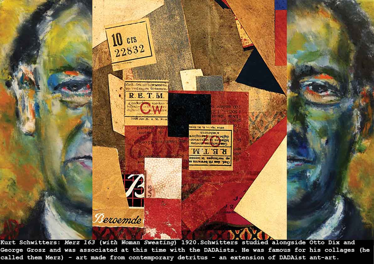
It is itself a comment upon the times that Kurt Schwitters and other German artists (Raoul Haussmann, George Grosz, etc ) of this period made art with the detritus and ephemera of the modern city. Post-war Berlin, already having suffered the blockade deprivations of the War, food and fuel shortages caused by war-conscription and poor planning, was further devastated by the failed communist coup of 1918, post-war poverty, the influenza epidemic and rapid economic inflation. Collage and photo-montage were considered the most appropriate forms to attack bourgeoise notions of art – the bourgeoise that had supported the militarism of the war. Otto Dix, Käthe Kollwitz, George Grosz and other artists reflected on the War and its effects by developing a scathing realism – and Schwitters’ special genius was in turning reality into art – transforming rubbish into beautifully harmonious collage in his Merz series.
Robert Wiene: Das Kabinett des Doktor Caligari (The Cabinet of Dr Caligari) 1920
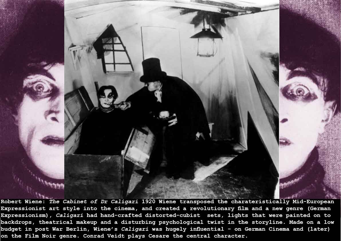
This film marks the collision of two powerful cultural forces – expressionist art, and the movies.It is important for two reasons – it marks the beginning of the influential German Expressionist film genre, and it is an early landmark in the century-long development of ‘Total Cinema’ – the idea that the film-maker can use an extensive range of media to create a cinematic vision (in 1924, Lazlo Moholy Nagy proposed a Theatre of Totality – q.v.). In Caligari, Wiene and his creative team – working in the appalling strictures of post War Berlin – with intermittent power, low budgets, – a 3 week shooting schedule – attempt to make a total film (controlling all the aspects of picture-making). As Mark Cousins describes:
“Wiene and his designers Hermann Warm, Walter Reiman and Walter Rohrig found a third way, (not using the totally artificial-lighting approach, nor the totally natural lighting approach). They flooded their set with flat light and then painted the shadows directly onto the walls and floor. The effect was to stylize the look of naturalistic film lighting, almost to ridicule it.” (Cousins: The Story of Film 2004).
Some critics play down the impact of Expressionism (as a style and technique of painting) on Weine – but surely Caligari speaks for itself: It is a three-dimensional expressionist painting, inspired (or at least influenced by – or existing in the context of) the short-lived German Expressionist Theatre innovations; the expressionist stage designs of Edward Gordon Craig and Adolphe Appia; the cubist architecture of Josef Chochol; Hanns Heinz Ewers and Stellan Rye’s The Student of Prague (1913, film sets by Robert Deitrich and Klaus Richter) – and much else of this vein.
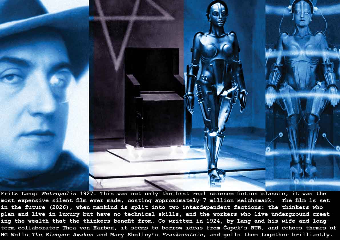
In terms of total cinema – not until the breakthroughs of computer 3d modelling and animation in the late 20th century did film-makers have the tools to create a consistent non-natural mise en scene as effective (or as low-cost) as Caligari. The brilliantly realized futuristic cinematic environment of Metropolis (Fritz Lang 1927) made this the most expensive silent movie of all, and the optical effects and production design ingenuity of Kubrick’s 2001 A Space Odyssey (1968) stand as a marker of the immediately pre-digital achievements of special effects artists and designers.
Karel Capek: Rossum’s Universal Robots (1921)
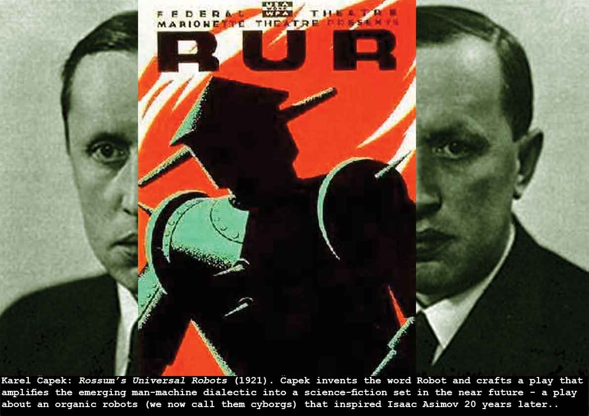
Karel Capek published Rossum’s Universal Robots in 1921, simultaneously inventing the word Robot, and creating a science-fiction tradition in Czechoslovakia. Robot is derived from the Czech Robota – which can mean work you don’t really want to do, or work that is tedious. His play has been performed around the world, and the word Robot was subsequently made really famous by Isaac Asimov in the 1940s (stories collected as I Robot 1950).
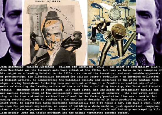
John Heartfield: Tableau Rastadada – collage for DadaGlobe (1921) + The March of Rationality (1927)
Yevgeny Zamyatin: We 1921 (published 1924)(centre-stills from Yakov Protazanov: Aelita 1924)
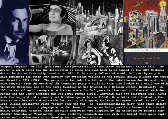
The wonderful confluence of science (astrophysics, cosmology,behavioural sciences, etc), art (Suprematicism, Futurism, Constructivism – Kandinsky, Tatlin, etc), utopian politics (Lenin, Bogdanov, Trotsky etc)), Music (Prokofiev, Scriabin, Shostakovich etc), Film (Protazanov, Vertov, Kuleshov, Eisenstein etc) and the psychological and spiritual investigations of Ouspensky, Pavlov, Luria – and Zamyatin’s We fits into this smorgasbord of creative ideas, as does the film Aelita of 1924. But it’s the terrific influence that We had outside the Soviet Union, that makes it a significant media innovation. Think of the way the political and social revolution of the Russian experiment produced an outpouring of cultural artefacts in the years 1910-1930 – Tatlin’s Monument to the Third International, Vladimir Shukhov’s Moscow Radio Tower, the graphics of El Lissitsky and Rodchenko. the paintings of Malevich and Kandinsky, the revolutionary films of Kuleshov, Vertov, Eisenstein and many others, the poetry of Mayakovsky, Pasternak, Marina Tsvetaeva – and the rest! And Lenin, Trotsky, Bukharin, Bogdanov – with his Universal Systems Theory (Tectology) – and his prediction of State Capitalism, (Bogdanov had also published Red Star in 1908 – a proto-feminist utopia created on Mars). This was a revolution in thought as well as in economics and politics. This was the context of the novel OneState of We.
Yakov Protazanov: Aelita Queen of Mars 1924.
Don’t you just love the alt-future genre? Aelita uses the real-life introduction of radio broadcasting to imagine an urgent message from Mars to Earth, and takes us from the contemporary Earthly fact of the Soviet New Economic Policy (1921) into a failed revolution against the capitalist society on Mars, with much futurist costumes and production-design (echoing those designed by Malevich for Victory over the Sun (1913). Metropolis, Fritz Lang’s great vision of the future: appeared in 1927.
Walter Ruttman + Hans Richter + Viking Eggeling + Oskar Fischinger: Absolute Film 1921.
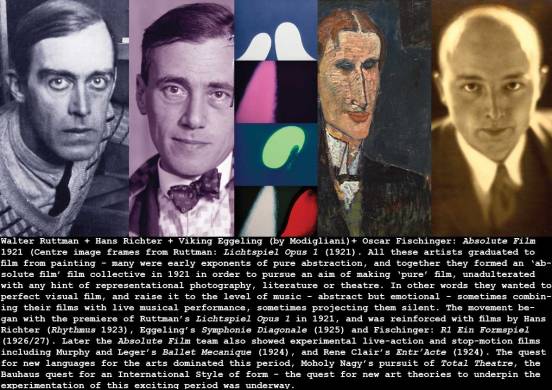
As an example of Absolute Film – Walter Ruttman: Lichtspiel Opus 1 1921
Fernand Leger: Three Women 1921
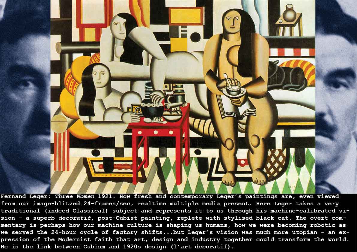
The post-Cubist painting scene still carried the cubist tropes of flattened perspective and simplified forms. Leger’s Three Women anticipates the absorption of cubist symbolism into art deco– the geometric decorative arts (after 1925), but this painting is also – like much of Leger’s recent work (The Card Players 1917) – about man and machines – the mechanisation of society – the 3 women are reduced to stylised machine parts – geometric primitives. For Leger the machine age is not threatening – it holds the promise of a society bonded by the mechanization and mass production of all of mankind’s needs. The women here try to express Leger’s vision of the harmony of man and machine. His choice of a timeless art theme – the three graces – was also a nod to those in the early 1920s calling for a return to order after the creative chaos of DADA.
El Lissitzky: Program Sheet for the electro-mechanical show Victory Over the Sun 1921
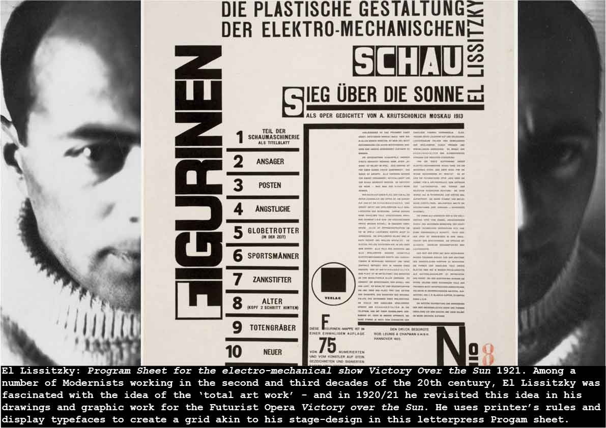
The grid is the underpinning architecture of modern graphic design, a blue-pencil matrix allowing the designer to dispose typographic elements (display and body typesetting, printer’s furniture – rules, logotypes etc – images (halftone-plates and line-engravings etc) together in an harmonious, integrated layout. In modern times, de Stijl and the Bauhaus pointed the way, but the Russians – El Lissitzky, Rodchenko etc – exploited this modernist design methodology with great aplomb – later adding a dynamic upward-thrusting diagonal axis too. But while the grid facilitated the non-symmetric layouts of the 20th century, its use stretches back to ancient times – to the Cuneiform tablets and heiroglyphics of the Middle East, and the pencilled grid is a feature of illuminated manuscripts, too. A good guide to the history of grids and modern graphic design is Philip Megg’s History of Graphic Design (1983). In El Lissitzky’s work, note the harmonious relationships between all elements of the layout – reinforced and accentuated by heavy printer’s rules, and the tight, justified columns of text, the underpinning grid ensures alignments of every aspect of the constructivist design. And the lengths Lissitzky must have gone to make or have made the reversed-out characters in his display font!
Louise Brooks + Gloria Swanson + Joan Crawford: the femmes du monde 1920-1930
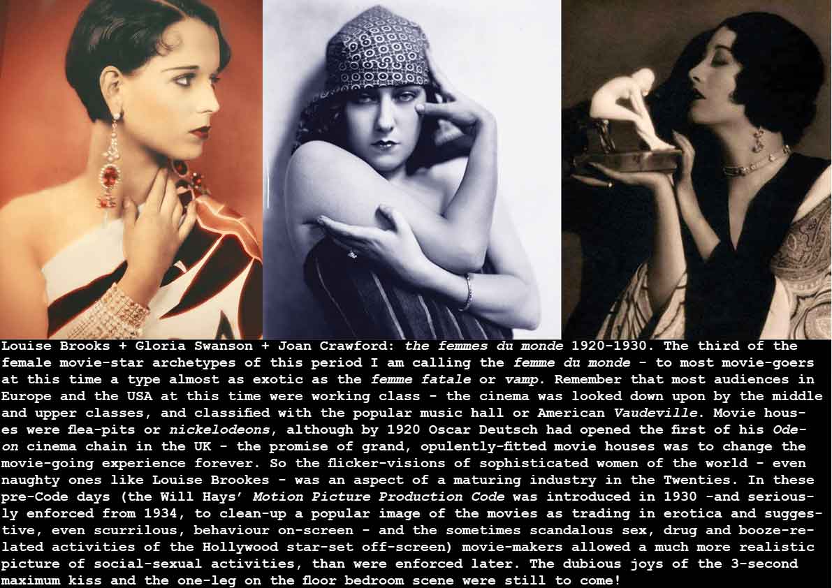
The early twenties seem to be the time when our models of modern women emerge and are personified in the actresses and film-stars. Edgar Morin comments in The Stars (1960):
“Then begins, from 1920 to 1931-32, a glorious era. Several great archetypes polarize the screen. The innocent or roguish virgin with immense eyes and half-open or sweetly mocking lips (Mary Pickford, Lillian Gish in the United States, Suzanne Grandais in France). The vamp of the North and the great prostitute of the Mediterranean reveal their separate essences and sometimes blend into the great archetype of the femme fatale, who rapidly becomes universal: (Morin says: ‘in 1922 Shotaro Hanayagi introduces the vamp into Japanese cinema’).
Between the virgin and the femme fatale blossoms la divine, as mysterious and as sovereign as the femme fatale, as profoundly pure and as destined to suffer as the young virgin. La Divine suffers and causes suffering. Garbo incarnates the ‘beauty of suffering’, says Balaz (The Theory of Film, p288). ‘It is the suffering of solitude… Her pensive gaze comes from far away.’ (ibid) She is elsewhere, lost in her dream, inaccessible. This is the source of her divine mystery. The schizophrenic idol is opposed to the ever-present woman, companion or sister, who does not inspire adoration, ie love. She transcends the femme fatale by her purity of soul.” (Edgar Morin: The Stars 1960 pps 12-13)
see also:Paul McDonald: The Star System – Hollywood’s production of popular identities (2000)
Raoul Hausmann: Spirit of Our Time 1921
In 1960, Joseph Licklider, the American information technology pioneer, wrote a paper titled Man-Computer Symbiosis, explaining in his summary:
“Man-Computer Symbiosis is an expected development in cooperative interaction between men and electronic computers. It will involve very close coupling between the human and the electronic members of the partnership…”
(J.C.R. Licklider: Man-Computer Symbiosis 1960)
Forty years earlier, the DADAist Hausmann embodies this idea – of man-machine synthesis – in an image that reminds me of components of Giorgio de Chirico’s Great Metaphysician (1917) – and so we have this zeitgeist image emerging early in the 20th century. Of course, the 1920s idea was of workers and manufactories – often giant steel mechanical machines. Consider the pace of this human-computer (man/machine) symbiosis in the 21st century – how many of us don’t have a smart phone, personal music pod, tablet or pad (or smart watch) about our persons most of our time? We are adding ‘intelligence’ (AI) to our machines as fast as we are designing machines ever more adaptable to our needs…
Piet Mondrian: Composition Red Yellow Blue 1921
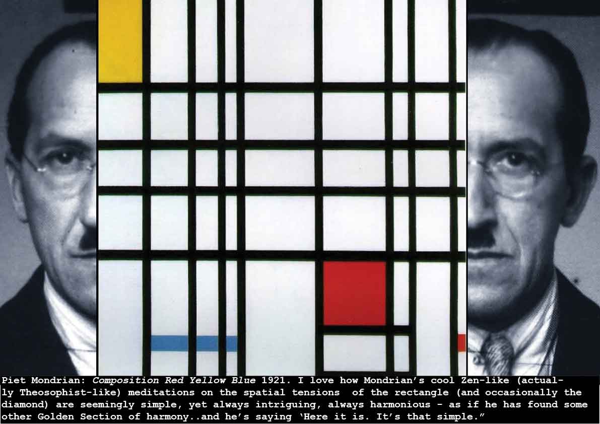
These paintings, ever since I first saw them in reproduction, have an algorithmic fascination for me. They are like 11th century churches – simple, beautiful, calming, reassuring – works that invite you to lose yourself in contemplation of the mystic harmonies. And when you begin to analyse these responses, you discover that they are triggered or catalysed by the artist (or Medieval builder-architect) using some fundamental laws of order and harmonics. Mondrian’s abstract painting- and the idea of the new art (neo-plasticism) – as I mentioned above, emerged from a post-War revulsion against the chaos of the previous half-decade – a chaotic, experimental period that gave us many of the Isms of art that Lissitzky includes in his 1924 book (The Isms of Art) . The excitement of seeing (as a student), Mondrian’s beautiful series of gradual abstractions (The Red Tree 1908 and subsequent work), and even the slight revulsion at seeing the 1920s paintings (like Composition Red Yellow Blue) in actuality and in close-up (the technique that looked so meticulous in reproduction is actually quite crude on the canvas), I think made me appreciate these paintings even more. But it was their algorithmic quality – their ‘machine-like grace’ – that dominates for me. The idea of loading a machine with the formulae and heuristics for the divine harmonies of the Golden Section, the Fibonacci sequence, the canonical rules for 2-dimensional design – like Jan Tschichold’s Canon of Medieval Manuscripts (1954) etc, then seeding it with a randomiser and seeing what happens, fascinated me a while and resulted in several perspective drawings based upon these paintings, and several attempts to use Macromedia Director and it’s scripting language Lingo to construct them.
Then I discovered the wonderful work of Manfred Mohr, who, during the 1990s and later, was exploring the myriad possibilities of the multi-dimensional hypercube (see Mohr: space.color.motion P777 2002):
Manfred Mohr: Hypercube Series 2001
see also: Manfred Mohr: space.color.motion P777 2002
“P-777C “, 2002
Handmade PC w/P4, LCD 18”
68 x 13-5/8 x 12” / 173 x 34.7 x 30.5 cm
Manfred Mohr about this work series:
“The work phase “space.color” is based on the 6-dimensional hypercube. This geometrically defined structure has 32 diagonals. The two endpoints of each diagonal lie diametrically opposite in the structure. A “diagonal-path” is the connection of two such diametric points through the network of edges of this complex structure. In a 6-dimensional hypercube, each of these 32 diagonals have 720 different “diagonal-paths”. For each work a random selection of four “diagonal-paths” from this repertoire of 23040 (32×720) possible paths is made and shown in its 2-D projection. A 6-dimensional “diagonal-path” is built therefore from six consecutive connected vectors, each having a different but distinct direction. Each direction represents one of the six mathematical dimensions.
In “space.color” the four chosen “diagonal-paths” (thick lines) are ordered from 1 to 4 and the corresponding vectors are connected with thin lines. Thus vector pairs are created and together with the thin lines they form planar quadrilaterals, or color fields. The two outer “diagonal-paths” (1 and 4) are connected in the same way but without thin lines, wrapping the image around the outside of the bounding rectangle. The hypercube is rotated in 6-dimensional space and then projected into 2-dimensional space. The resulting image overlays the color fields from front to back. Together with the “diagonal-paths”, the resulting image creates otherwise unimaginable constellations.”
James Joyce: Ulysses 1921.
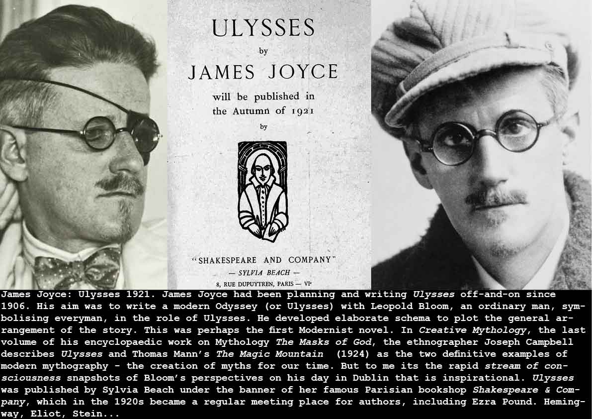
You should read this. Joyce was in commune with the Muse (the Lunar goddess): “Her antiquity in preceding and surviving succeeding tellurian generations: her nocturnal predominance: her satellitic dependence: her luminary reflection: her constancy under all her phases, rising and setting by her appointed times, waxing and waning: the forced invariability of her aspect: her indeterminate response to inaffirmative interrogation: her potency over effluent and refluent waters: her power to enamour, to mortify, to invest with beauty, to render insane, to incite to and aid delinquency: the tranquil inscrutability of her visage: the terribility of her isolated dominant resplendent propinquity: her omens of tempest and of calm: the stimulation of her light, her motion and her presence: the admonition of her craters, her arid seas, her silence: her splendour, when visible: her attraction, when invisible.” (from James Joyce: Ulysses 1922)
Max Ernst: Les Malheurs des Immortelles 1922 (self-portrait by Ernst 1905)
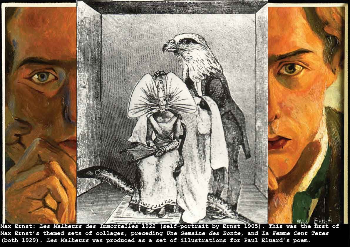
This was the first of Max Ernst’s themed sets of collages, preceding Une Semaine des Bonte, and La Femme Cent Tetes (both 1929). Les Malheurs was produced as a set of illustrations for Paul Eluard’s poem. This range of narrative collages, cut-ups from the vast store of Victorian magazine engravings that Ernst had access to at that time, are brilliant examples of the art of surrealist collage. The line (rather than tone) nature of the source engravings, make it easier to achieve high-quality ‘seamless’ collages, but that does not mitigate against the genius of Ernst’s vision. U. M. Schneede has commented:
“Disparate elements are here brought together in a less complex and more acute form. The man-beast hybrid makes its appearence and transforms an idyllic interior into a demonic stage-set … The twin starting-points of Max Ernst’s expressive impulse are a search for appropriate avenues for working out in visual terms the private obsessions of his childhood, and also his understanding of the Freudian analysis of such obsessions. His relationship with an authoritarian father, the pressures of middle-class family life, are psychoanalytically interpreted …”
(Uwe M. Schneede 1973)
Ernst certainly succeeds in creating images that evoke the terror and territory of the nightmare – that tap into that huge well of the unconscious that so fascinated the Surrealists, and that they devised many creative methodologies to explore (automatic writing, exquisite corpse, chance and coincidence, etc). The fascination for me lies in the fantastic juxtaposition of Victorian propriety and Surrealist imagination.
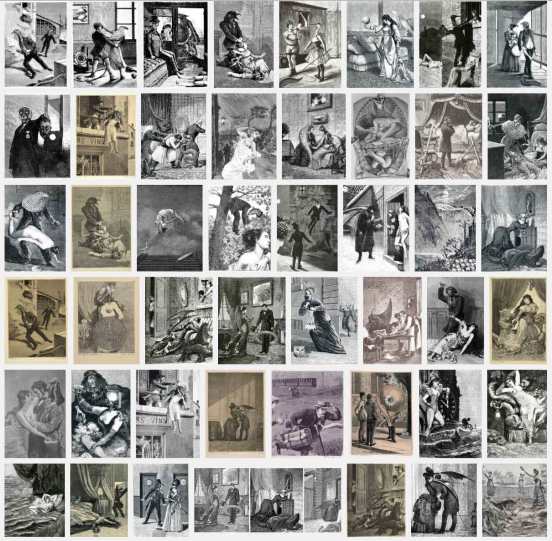
Max Ernst: Une Semaine des Bonte 1929 – sample prints
Alexander Medvedkin: Agit-Train 1922
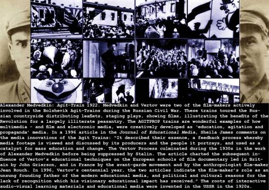
Medvedkin and Dziga Vertov were two of the film-makers actively involved in the Bolshevik AGITPROP trains during the Russian Civil War. These trains toured the vast Russian countryside distributing leaflets, staging plays, showing films, illustrating the benefits of the Revolution for an illiterate peasantry. The AGITPROP trains are wonderful examples of how multimedia – and film and electronic media, were creatively developed as ‘education, agitation and propaganda’ media. (stills courtesy of Barry Bliss)
see also Chris Marker: The Last Bolshevik – a biopic of Alexander Medvedkin
Warren Beatty: Reds (1981) – this Oscar-winning epic biopic of the life of the American Marxist-journalist John Reed has extensive clips of Beatty’s brilliantly reconstructed agit-kino trains invented by the Reds (communists) during the Russian Civil War in the early 1920s. Reed’s famous book 10 Days That Shook the World – published in 1919 – was the definitive first-hand ’embedded’ reportage of the 1917 Russian Revolution.
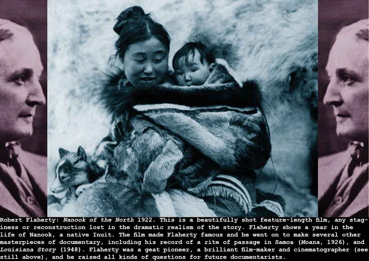
Robert Flaherty: Nanook of the North 1922
Lazlo Moholy Nagy: Ein Lichtspiel- Schwartz/ Weiss/ Grau 1922
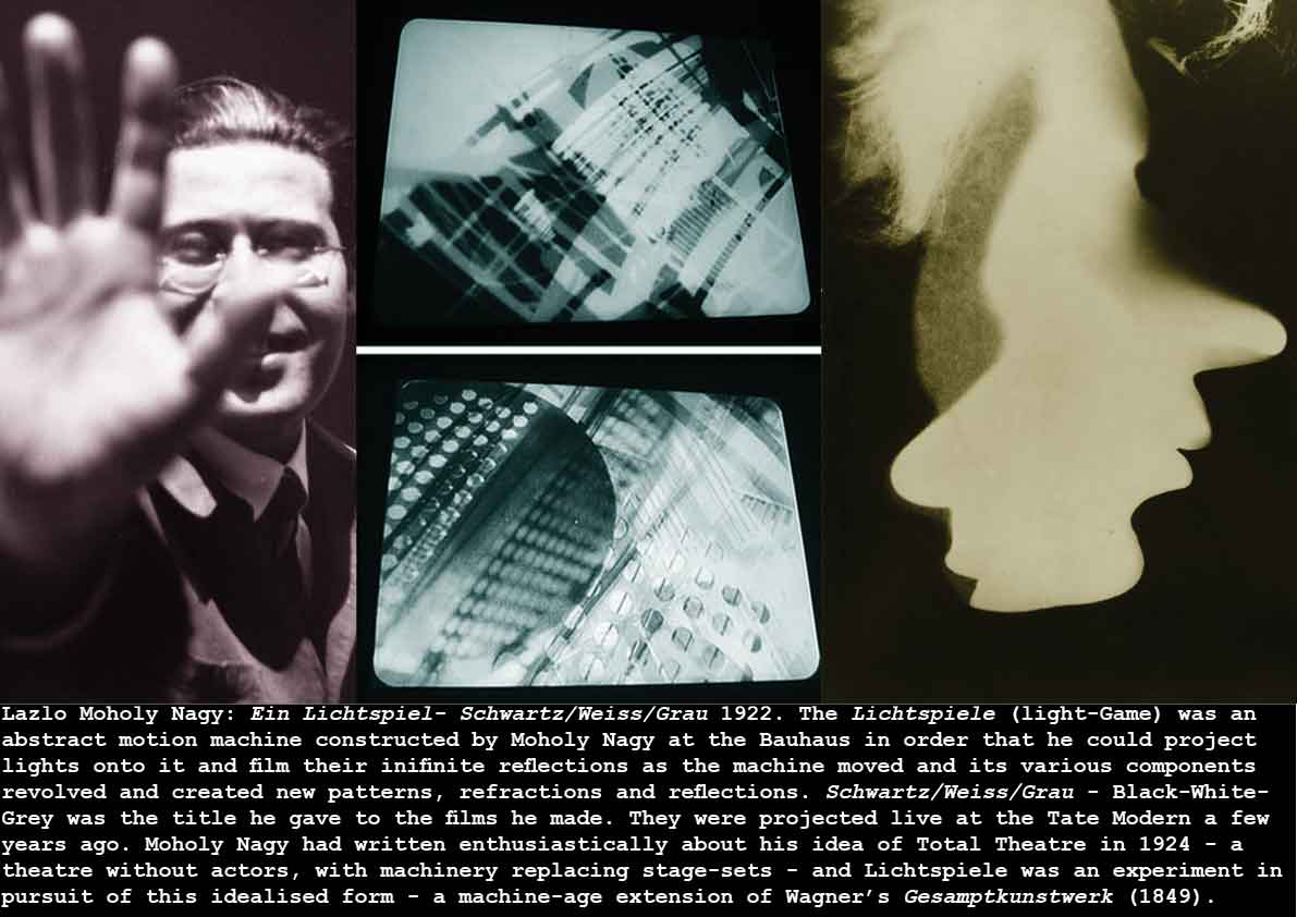
What wonderful thinking! Moholy Nagy, in the early 1920s right at the crucible of Modernism – at the Bauhaus – experimenting with the kind of Absolute Film ideas emerging across Europe, comes up with the notion of building a machine to make patterns that would be recorded on film – its a mechanical algorithm – a pattern generator for abstract film production!
Gustavs Klucis: Propaganda Stand-System (Workers of the World) 1922
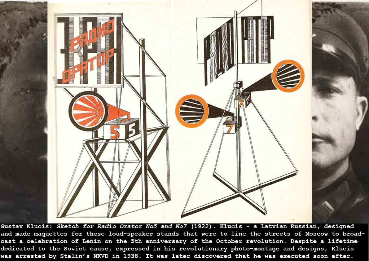
Klucis’ work in the flowering of the USSR – when artists could still be optimistic in the communist vision – was exceptional. He married the latest communication technologies and methodologies of constructivist graphics, 3d constructions of welded metal, electric loud-speaker/PA systems, and State advertising and propaganda (colloquially agitprop) to make his Radio Orator and other embodiments of what George Orwell later labelled newspeak in the 1920s. These must be considered alongside Rodchenko’s Living Badge, Tatlin’s projected Monument to the Third International, Medvedkin’s Agit Kino trains, Dziga Vertov’s Kino-Eye documentaries, and Shukov’s Moscow Radio Tower – all roughly contemporary – in this flowering of new visions and new purposing of communications media.
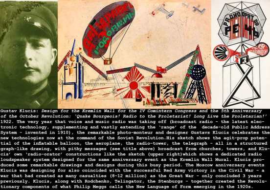
Gustavs Klucis: Design for the Kremlin Wall for the IV Comintern Congress and the 5th Anniversary of the October Revolution: ‘Quake Bourgeois! Radio to the Proletariat! Long Live the Proletarian!’ 1922
Of course, the ‘New Language of Form’ that Philip Meggs refers to in his encyclopedic Meggs History of Graphic Design (from 1983) was the result of a trans-European change of consciousness about the medium of print and graphics-based communications. This ‘new language’ emerged fully formed in the 1920s after several revolutionary incursions into the bastion of Print in the period immediately before. These incursions came from a great variety of sources and causes, loosely following this chronology: the work of William Morris, Charles Voysey, Cobden Sanderson, and Emery Walker in the private press/arts and crafts movement; the poster designs of Jules Cheret, Toulouse Lautrec, Alphonse Mucha; the illustrations and graphic works of Aubrey Beardsley, Winsor McCay; the architectural drawings and designs of Otto Wagner, Frank Lloyd Wright, Charles Rennie Macintosh, Walter Gropius, Josef Hoffman; the industrial-designs and corporate identity designs of Peter Behrens; the designs of Kolomon Moser and Moriz Jung at the Wiener Werkstatt. It is the innovation and development of new graphic forms from this wide range of designers, illustrators, architects, cartoonists, that all contributed to the modernist revolution in what became known as graphic design.
Germaine Dulac: La Souriante Madame Beudet (The Smiling Madame Beudet) 1922 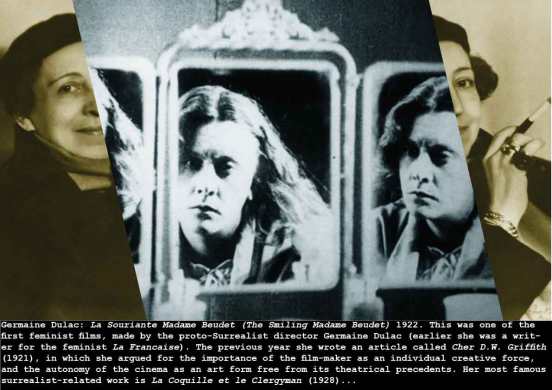

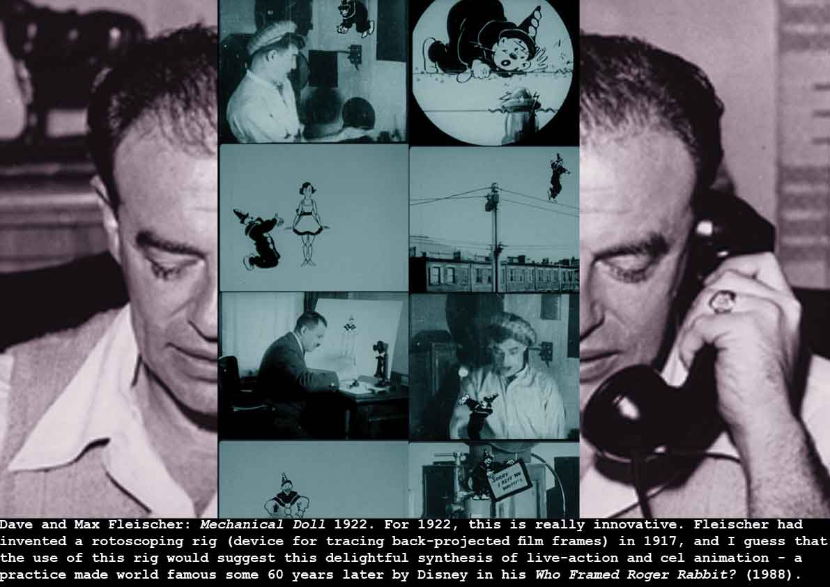
Dave and Max Fleischer: Mechanical Doll 1922
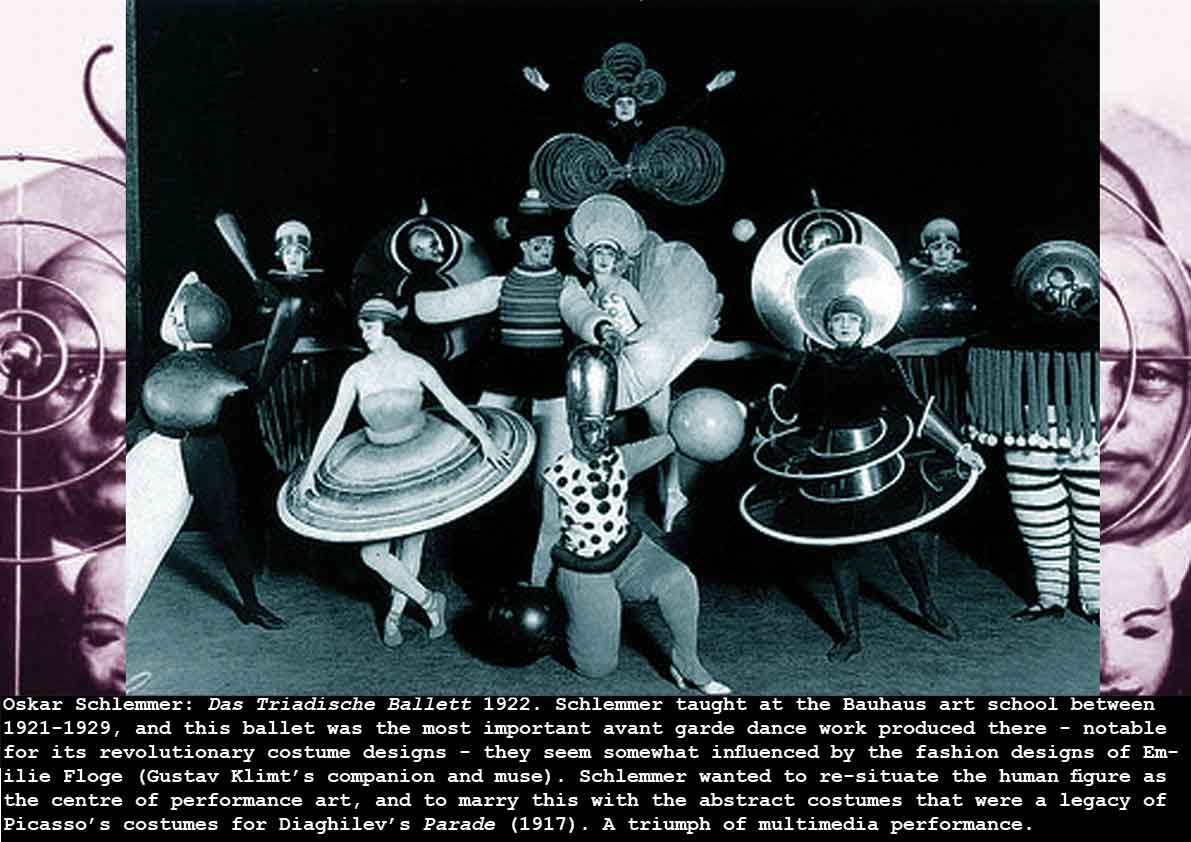
Oskar Schlemmer: Das Triadische Ballett 1922
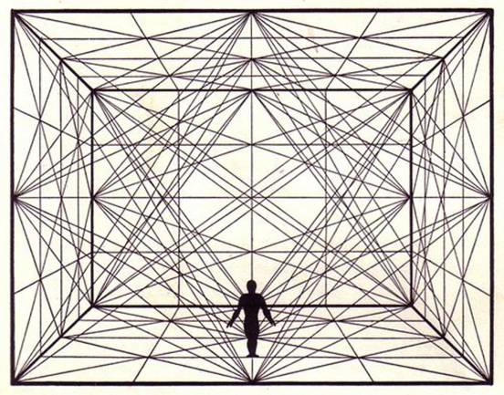
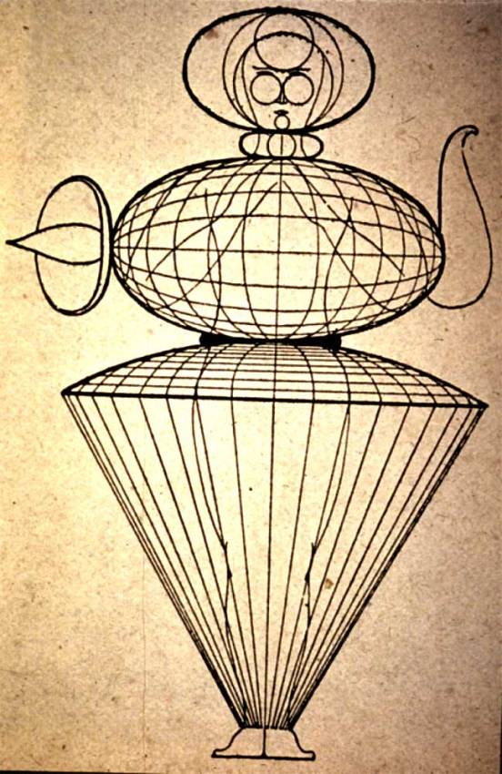
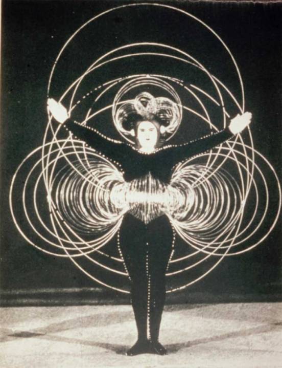
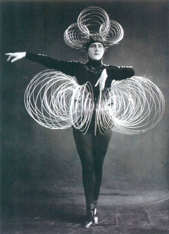
Oskar Schlemmer: Costume designs echoing the cubist space of the theatre 1920-1922. For the Bauhaus Theatre – from theory to practise.
Joan Miro: The Farm 1922 + The Tilled Field 1923-4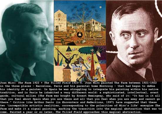

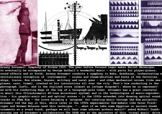
Arseny Avraamov: Symphony of Sirens 1923
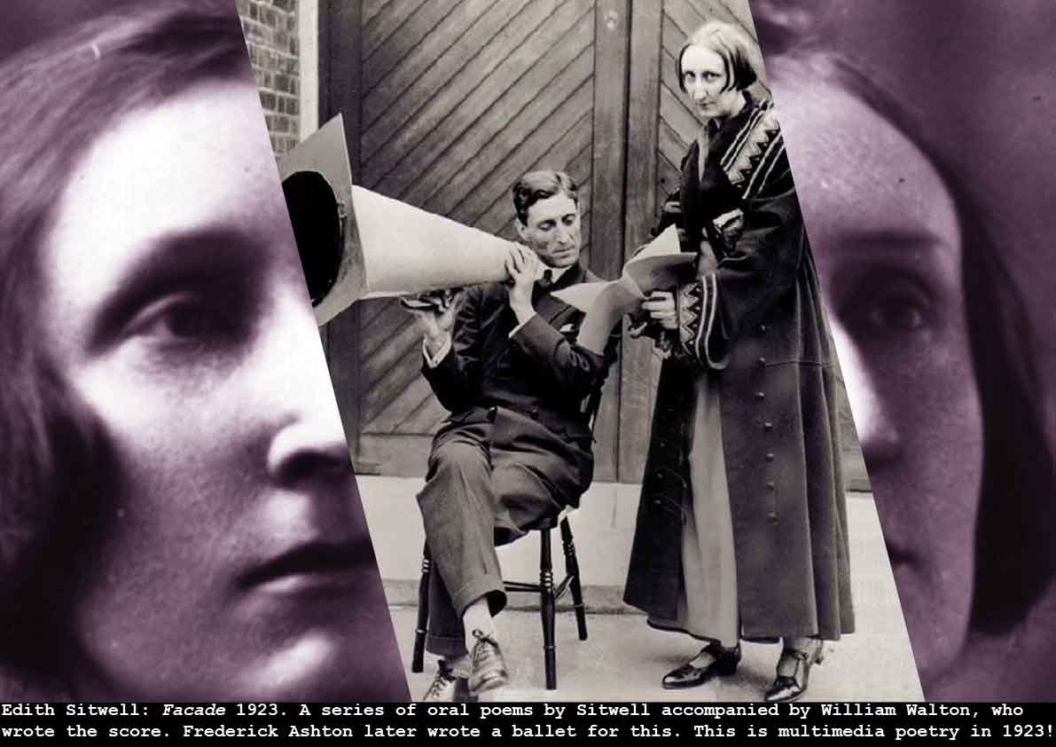
Edith Sitwell: Facade 1923
Alexander Rodchenko + Vladimir Mayakovsky: The Best Nipple (advert) 1923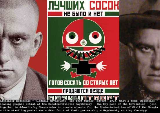

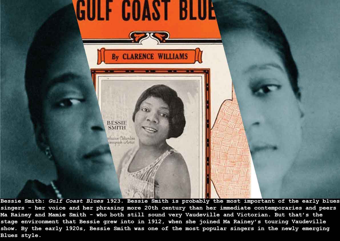
Bessie Smith: Gulf Coast Blues 1923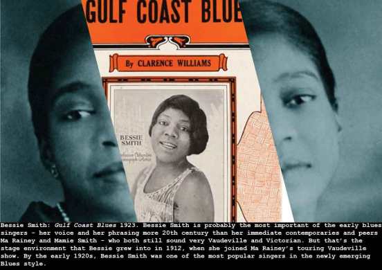
Alexander Rodchenko + Varvara Stepanova: Living Badge 1923
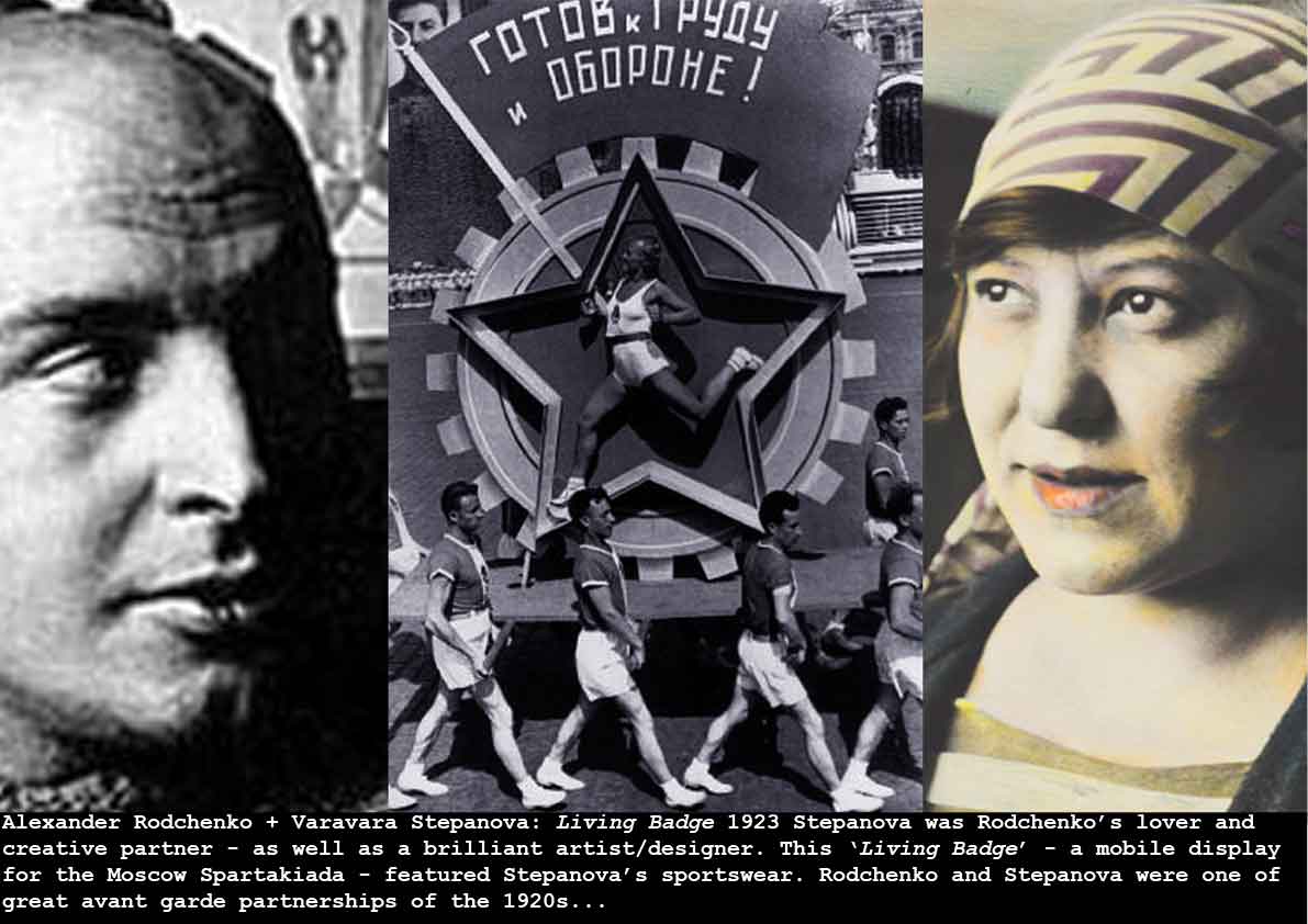
This rare image captures something of the fusion of Rodchenko and Stepanova’s talents – hers in costume and fabrics (she designed the sports-wear for this parade), his in dramatic, revolutionary graphic art and design. The inclusion of the beautiful athlete posed in the central Soviet star, in the act of winning, adds an iconic element of brave humanity to the vast industrial machine of the USSR.
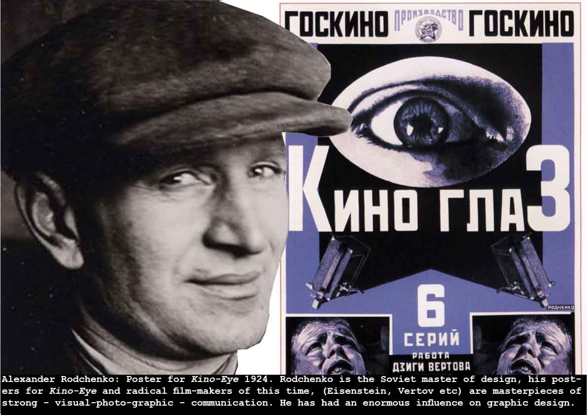
Alexander Rodchenko: Poster for Kino-Eye 1924
Edward Steichen: Gloria Swanson 1924
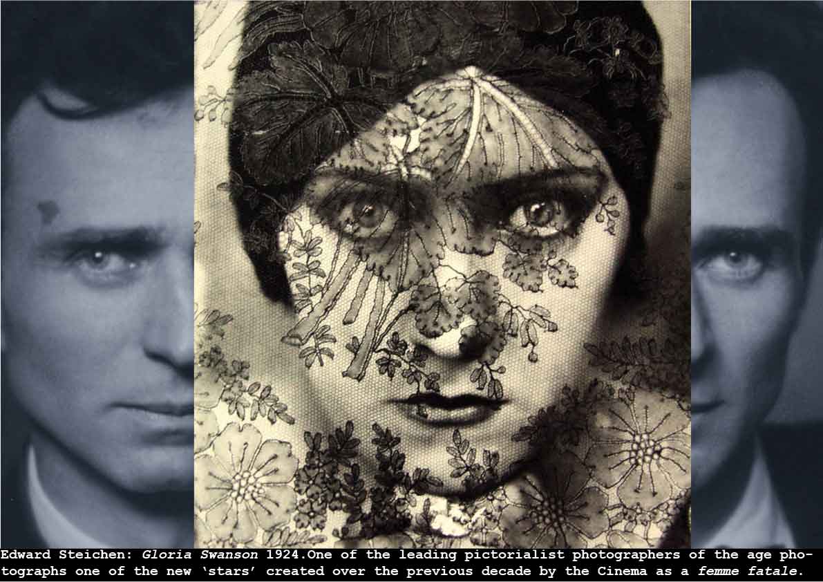
Trained as a painter, Steichen was in the middle of a mid-life crisis – recently (expensively) divorced, unsure of any further success as a painter, he is invited to lunch with the editor of the magazine Vanity Fair, and the owner and editor of Vogue magazine, Condé Nast. While in Paris in the previous decades (learning to paint, and be an artist-photographer), Steichen had taken some of the earliest fashion photographs (of Paul Poiret couture for Art et Décoration), and on the strength of these images, and some that Steichen had made of Nast’s wife and his daughter, he got the job of house photographer/portraitist on Vanity Fair – with the chance of occasional work for Vogue.
Steichen’s portraits of the newly emerging, exotic film stars of the early twenties – including this iconic femme fatale treatment of Gloria Swanson draped in black lace – captured the zeitgeist of these exciting times – the glamour and excitement and returning optimism of the Roaring Twenties personified in its stars and the celebrities emerging from the mass media.
see Todd Brandow: Edward Steichen in High Fashion: The Condé Nast Years 1923-1937 (2007)
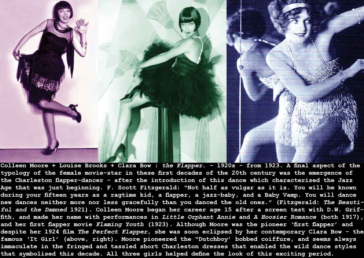
Colleen Moore + Louise Brooks + Clara Bow : the Flapper. – 1920s – from 1923
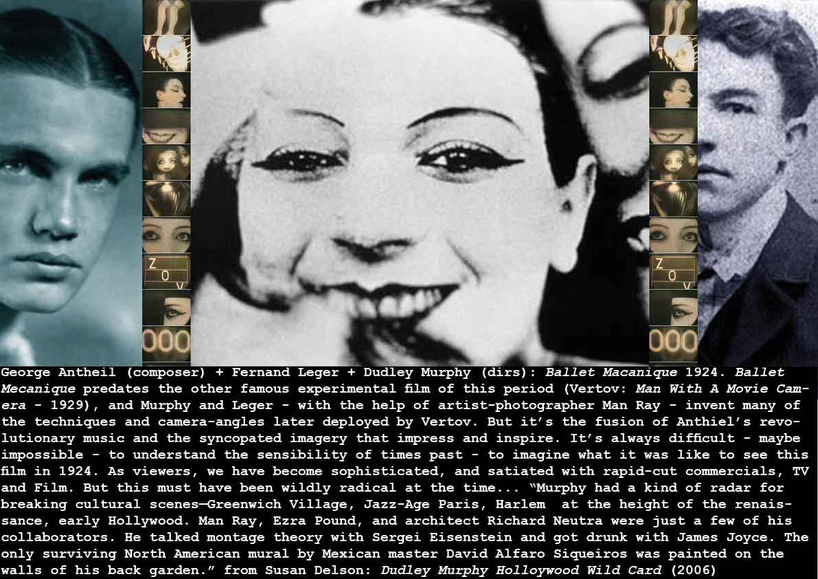
George Antheil (composer) + Fernand Leger + Dudley Murphy (dirs): Ballet Macanique 1924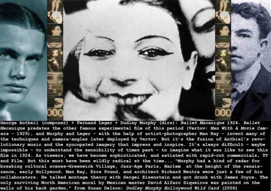
El Lissitzky + Hans Arp: Die Kunstismus (The Isms of Art) 1924
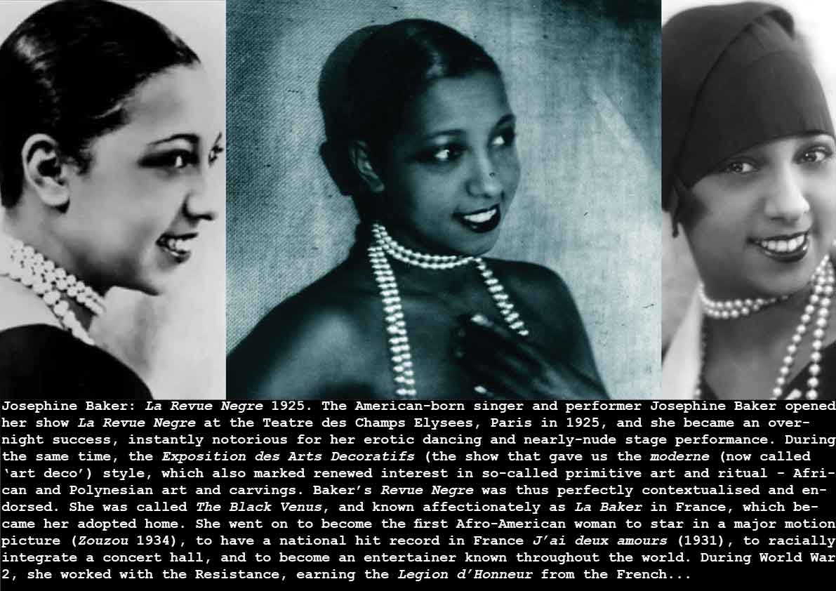
Josephine Baker: La Revue Negre 1925
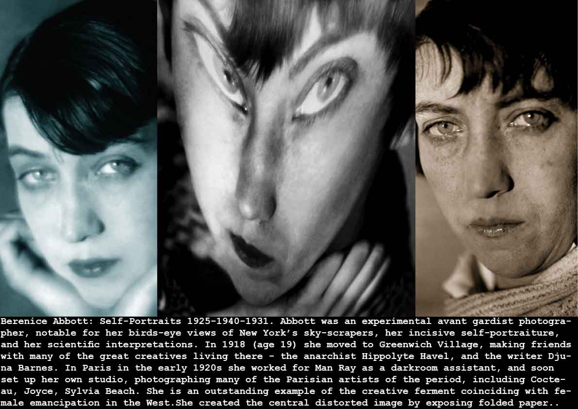
Berenice Abbott: Self-Portraits 1925-1940-1931
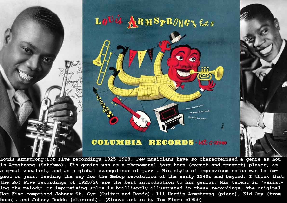
Louis Armstrong: Hot Five recordings 1925-1928
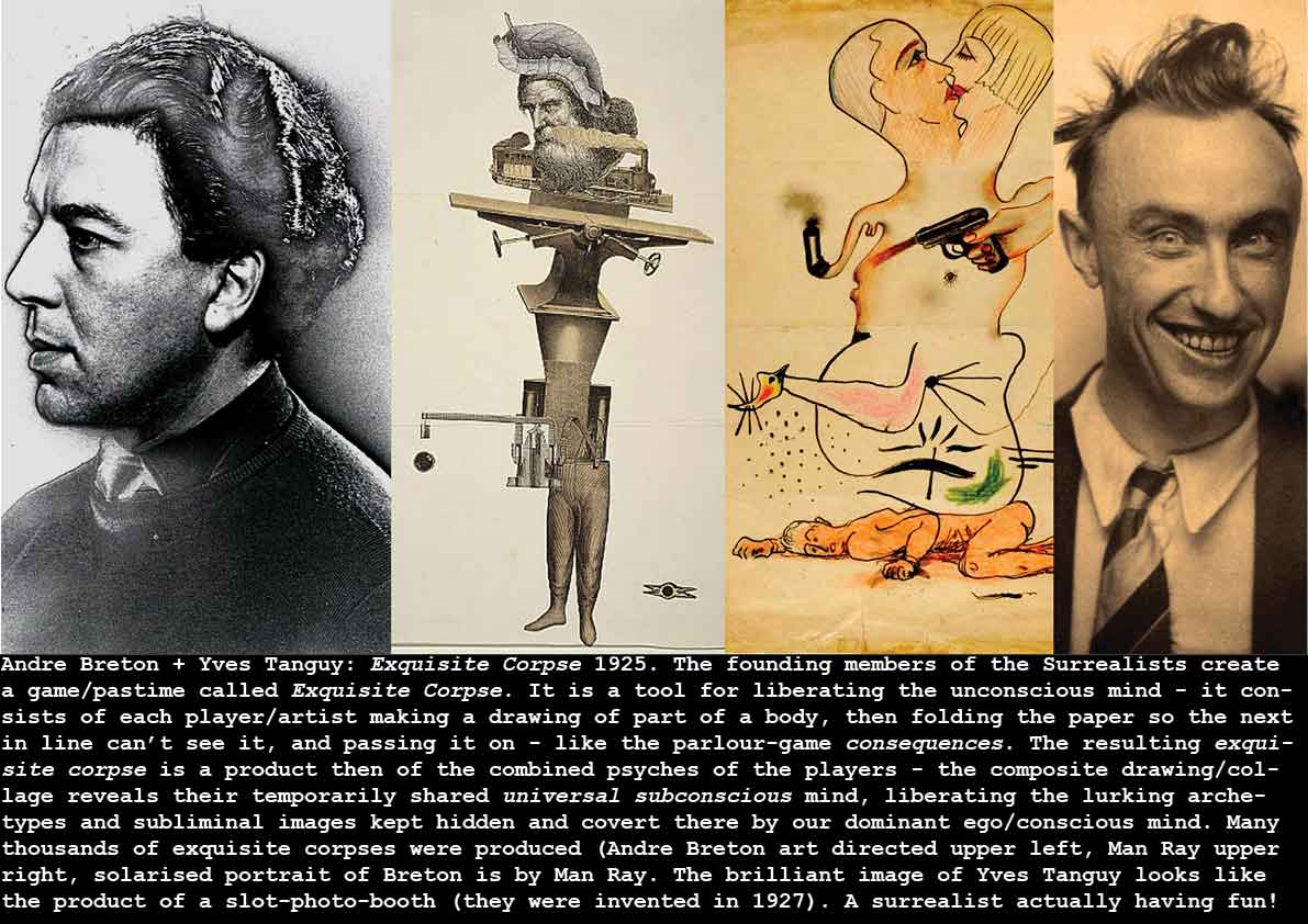
Andre Breton + Yves Tanguy: Exquisite Corpse 1925.
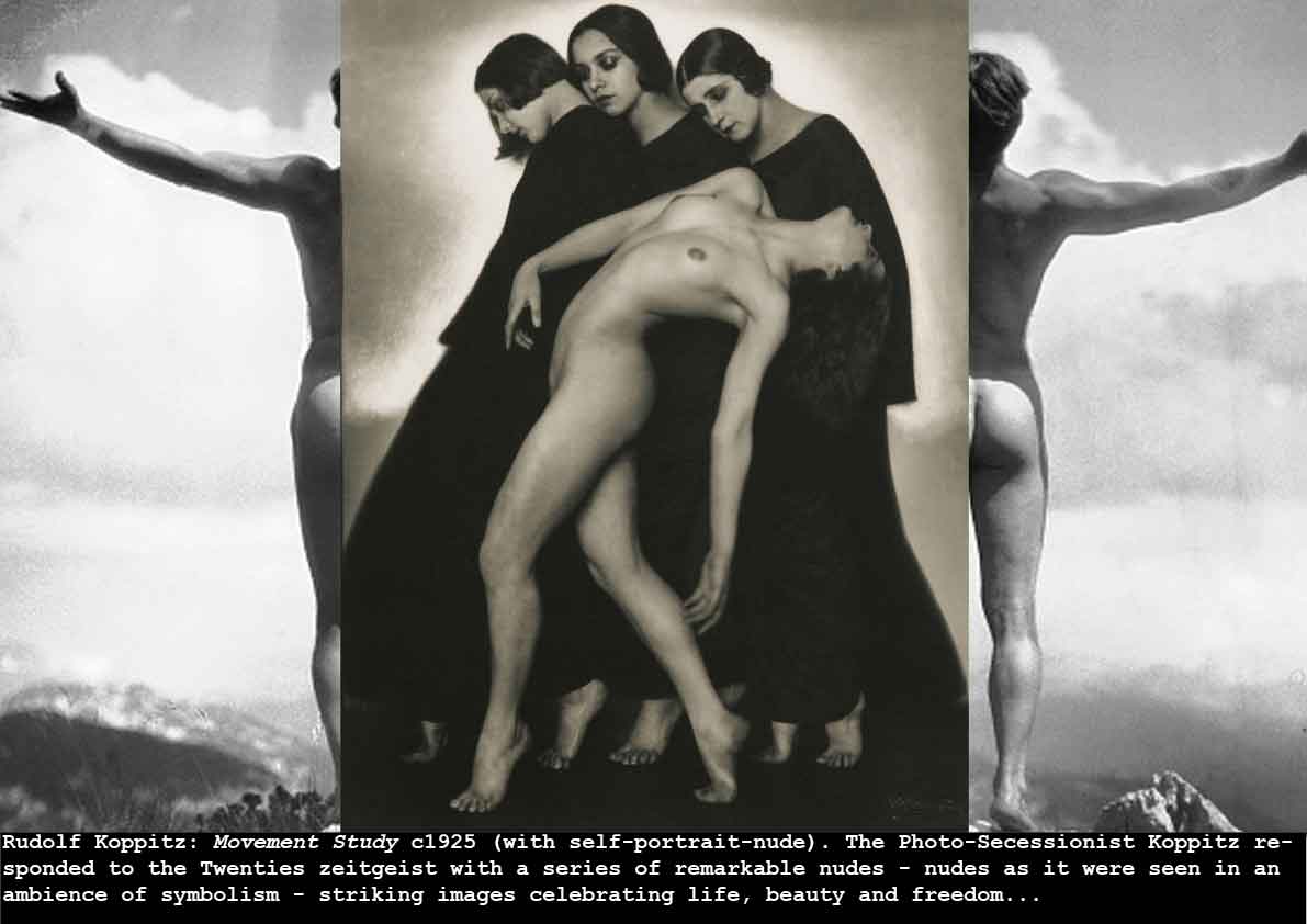
Rudolf Koppitz: Movement Study c1925 (with Self-portrait-nude)
Alexander Rodchenko + Lilya Bric: Books! 1925
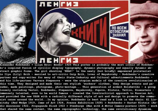
Rodchenko is almost certainly the most influential graphic designer of the 20th century, especially inspiring the70’s and 80’s British designers like Neville Brody, Jamie Reid, Malcolm Garrett. For example Brody’s designs for Nick Logan’s breakthrough life-style magazine The Face (1981-1986), and his launch designs for Logan’s Arena magazine (1986). Reid and Garrett enjoyed a much wider range of influences (Wolfgang Weingart, April Greiman, David Carson etc), but Rodchenko shines throughout the 20th century for his radical dynamism and his blend of dynamic simplicity.
Fritz Kahn: Der Mensch als Industriepalast (Man as an Industrial Palace) 1926
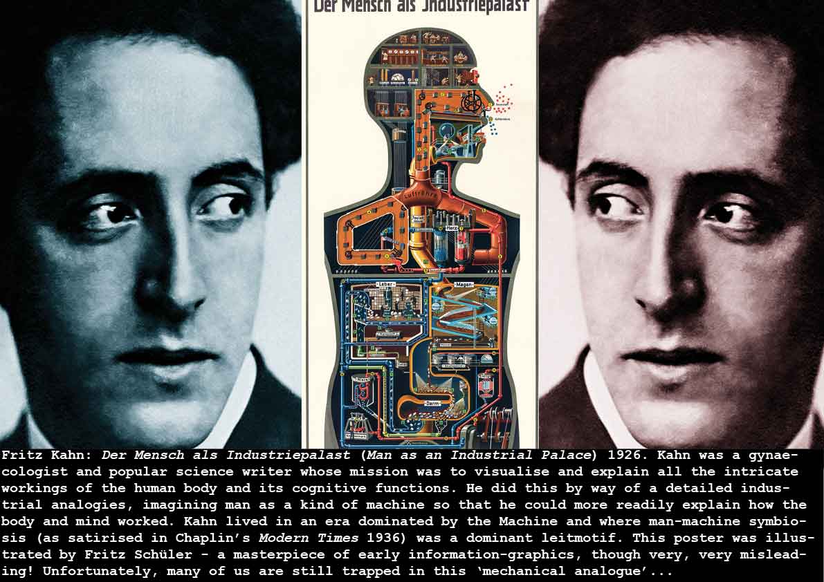
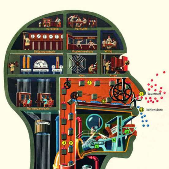
Fritz Kahn: Earlier, we talked about the emergence of the man-machine symbiosis embodied in Raoul Haussmann’s ‘Spirit of Our Time‘ (1921) – a symbiotic relationship that seemed to dominate some of the great cultural innovations of the 1920s – for example, Robotics (Capek: RUR 1921), the glorification of man’s labour in the factory (Lewis Hine: Steam Fitter, 1920; Fritz Lang: Metropolis 1927 ), Leger’s Three Women 1921) – and the rest of the century from Charles Chaplin’s Modern Times 1936) to the current fascination in the potential of artificial intelligence (originally called machine intelligence), driverless cars and robotics). Fritz Kahn takes this trope to its reductio ad absurdam in his inventive and beautifully drawn and painted mechanistic explanations of biological human functions. The best book on Kahn is Ute and Thilo von Debschitz: Fritz Kahn (Taschen 2013) – a grand coffee-table collection of Kahn’s work replete with insightful essays. My own introduction to Kahn was this diagram as a component of a print by Eduardo Paolozzi, and in Paolozzi’s short film History of Nothing – then seeing the same diagram referenced in a short experimental film by Stan Vanderbeek.
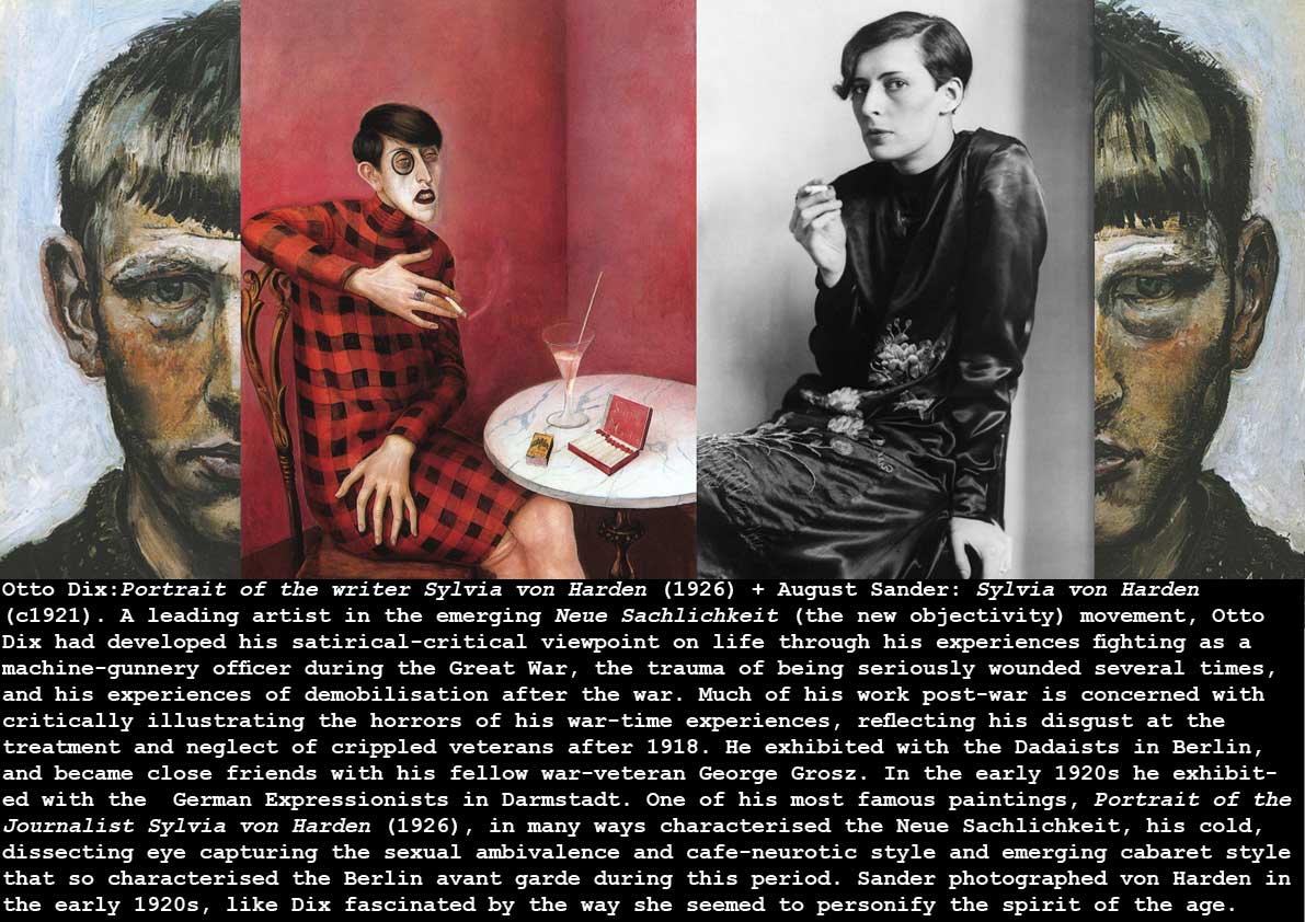
Otto Dix:Portrait of the writer Sylvia von Harden (1926) + August Sander: Sylvia von Harden (c1921).
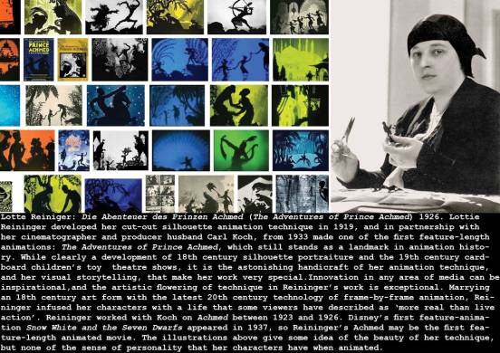
Lotte Reiniger: Die Abenteuer des Prinzen Achmed (The Adventures of Prince Achmed) 1926
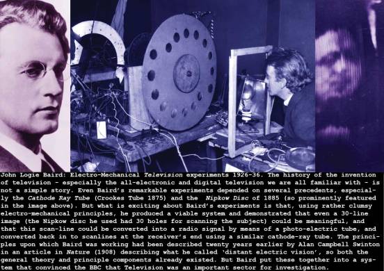
John Logie Baird: Electro-Mechanical Television experiments 1926-36
https://www.youtube.com/watch?v=PmjXwU0pYao
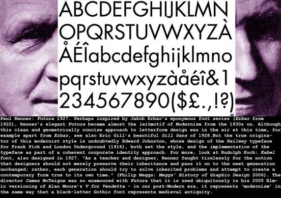
Paul Renner: Futura 1927
Emmanuel Goldberg: Statistical Machine 1927
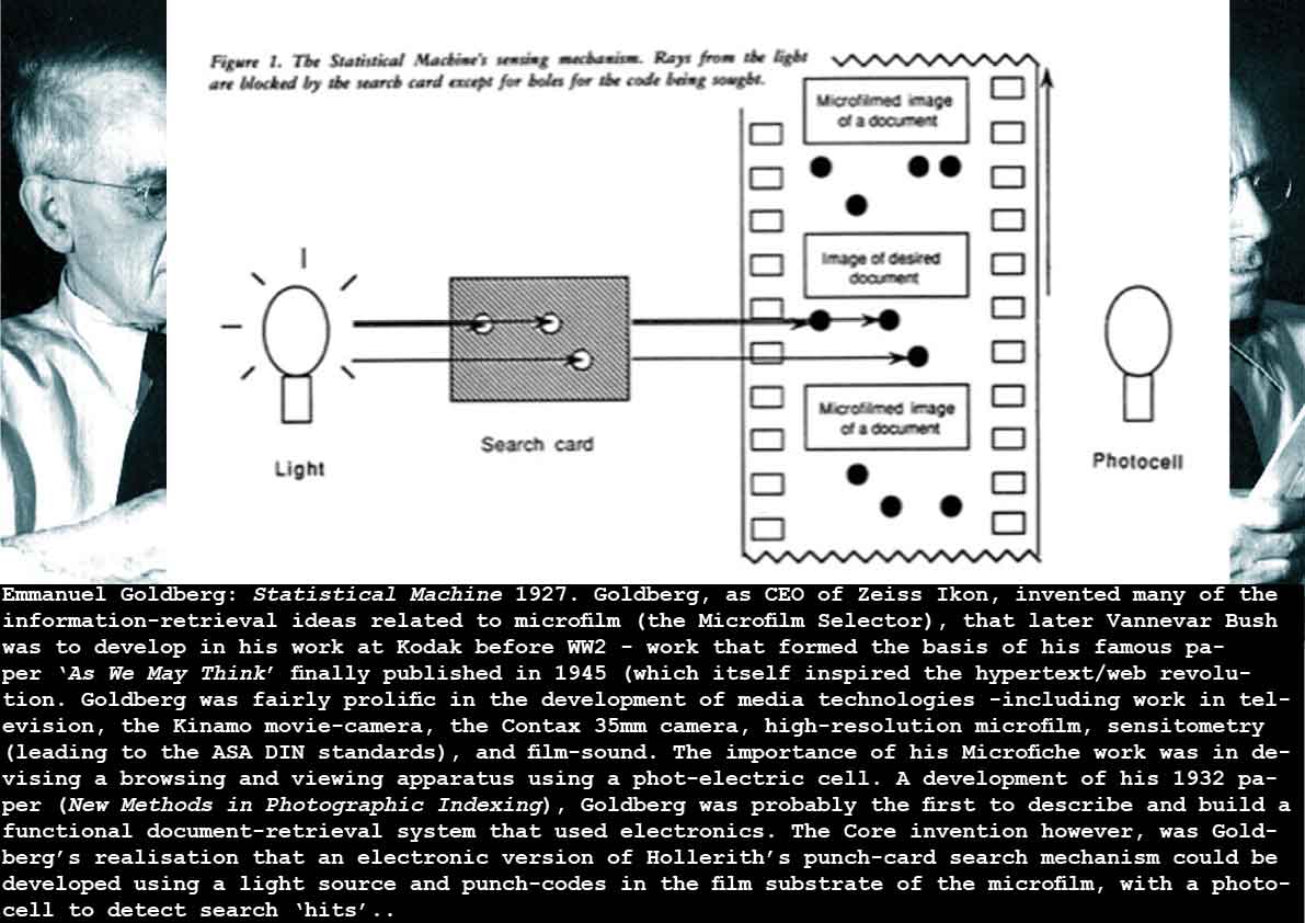
Why was this important in a history of the media arts and technologies? Because microfilm was the miniature data-storage technology that seemed to promise so much (in these pre-digital-computing times). It was the idea demonstrated at first by John Benjamin Dancer in the early 1840s (his microphotographic Daguerreotypes) that eventually led to the microfilm becoming the great white hope of information-processing and data-storage (though called documentation archiving then). The potential of microfilm was noted in the early 20th century by the Belgian Informatics and library classification innovator Paul Otlet (who eventually refined his vision of a global microfilm-based library accessible by phone and television, and called it the Mundunaeum (Otlet: Traite de Documentation 1934). By the 1920s the need to automate storage and retrieval mechanisms for microfilm archives became pressingly obvious, and thus machines like Goldberg’s began to supply this need. Later, Vannevar Bush would develop microfilm-selectors for Eastman Kodak that would inform his Memex idea in 1945.
Buster Keaton: The General 1927
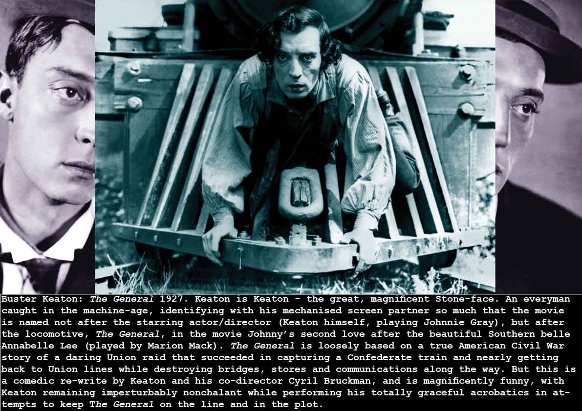
When I was growing up in the 1960s there was a revival of interest in the Silent era (led by, among others, Kevin Brownlow, an archivist at the British Film Institute), and my generation got to see at least a sample of the great actor-directors who dominated the Movie business before the Talkies (Chaplin, Sennett, Arbuckle etc). And Buster Keaton was the coolest of them all, an instant hero-figure for aspirant art students. It was his elegant, almost nonchalant acrobatics, his acute visual awareness of the possibilities of the Film medium, and of course his stony-faced portrayal of a common man caught up in the Machine Age….
Fritz Lang: Metropolis 1927
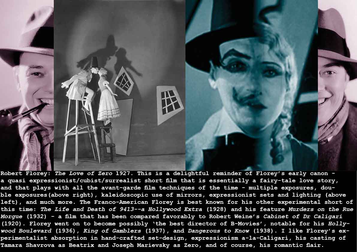
Robert Florey: The Love of Zero 1927.
Jan Tschichold: Die Neue Typographie (The New Typography) 1927
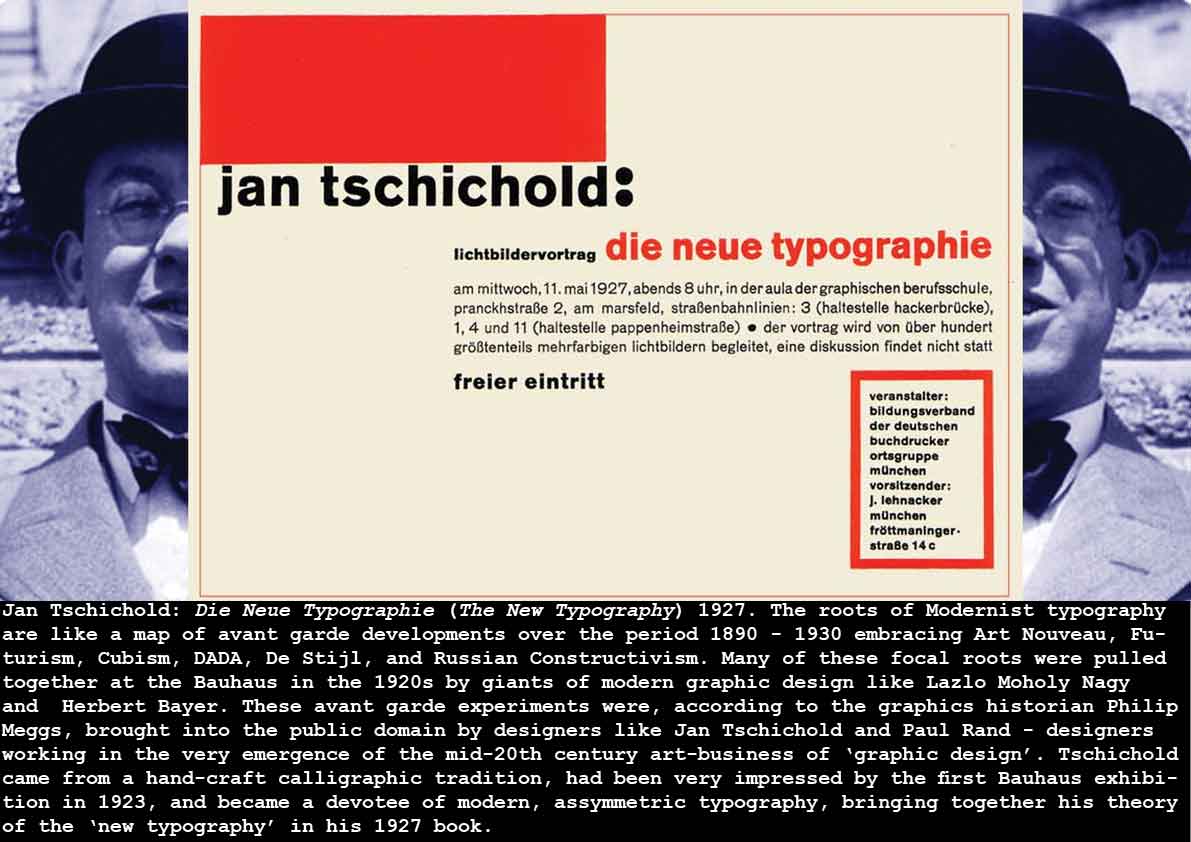
Graphic Design interests me most because of its power to integrate several important communications media together. Graphics can add bodily expression and nuance to words, the West’s primary communications medium, and designers deploy typography, calligraphy and letterform design and display, as well as graphic lay-out and the composition of the printed page to this end. Designers also use illustration, photography, colour and decoration (as well as tacility, surface-treatment – like varnishing, embossing etc) to amplify and reinforce a textual message. As I mention above, in the period of the 1920s, traditional approaches to book-design – and the design of posters, magazines and other print media – were being radically over-hauled by the leading-edge artists and designers emerging from various avant garde movements of the previous 2 or 3 decades. The principle effect of these developments was in the abandonment of symmetry, and the examination of new non-symmetrical, rational, and visually experimental and ergonomic disposition of printed matter on the page. And as the experimentalists of the Bauhaus and others (Russian Constructivists, DADAists, De Stijl designers etc) pushed these experiments in visual communication and expression into new territories, the craft-designer Tschichold took it upon himself to evangelise, popularise and explain these experimental approaches to the wider and more commercial culture – to bring the avant garde into the mainstream as it were.
“For the October 1925 issue of Typographische Mitteilungen (Typographic Impartations), Tschichold designed a twenty-four-page insert entitled ‘Elementare Typographie’ which explained and demonstrated asymmetrical typography to printers, typesetters and designers. It was printed in red and black, and featured avant garde work along with Tschichold’s lucid commentary. Much German printing at this point still used medieval textura (gothic-typefaces) and symmetrical layout. Tschichold’s insert was a revelation and generated much enthusiasm for the new approach.”
Philip Meggs: Meggs’ History of Graphic Design 2006
And of course this extensive insert formed the basis of his 1928 book Die Neue Typographie.
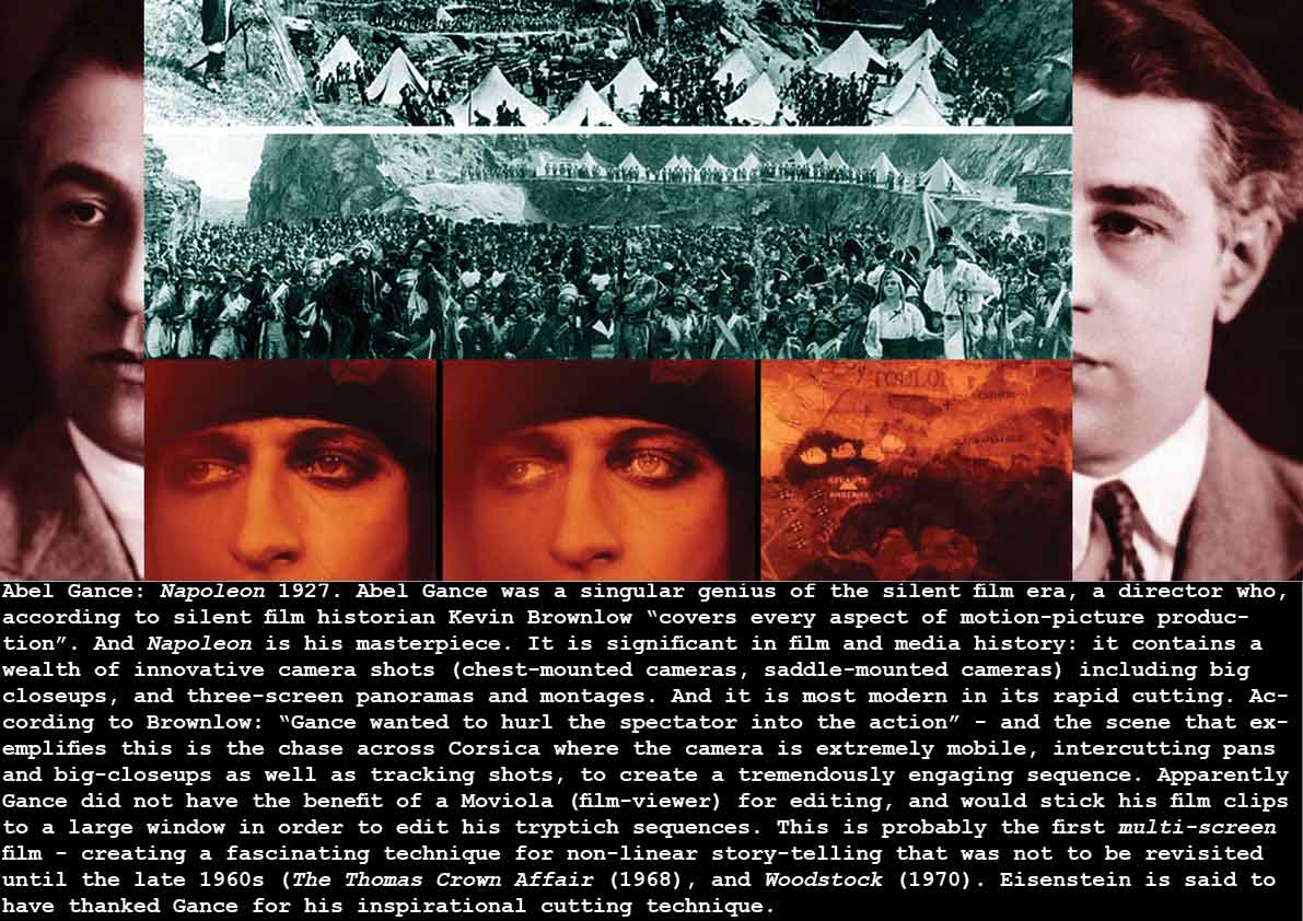
Abel Gance: Napoleon 1927
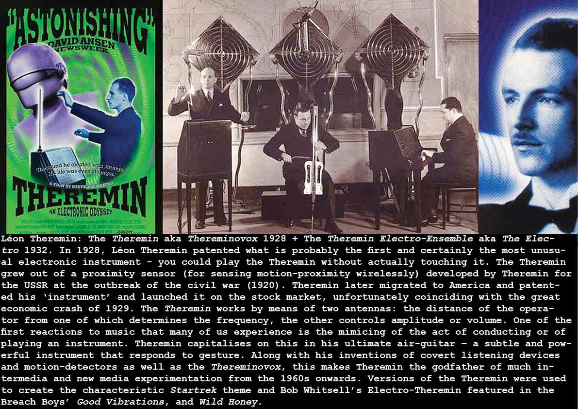
Léon Theremin: The Theremin aka Thereminovox 1928 + The Theremin Electro-Ensemble aka The Electro 1932
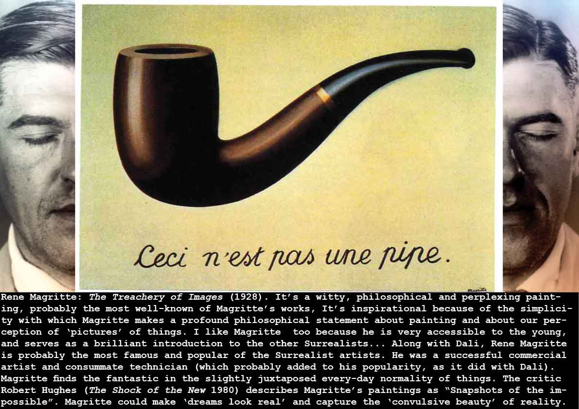
Rene Magritte: The Treachery of Images (1928)
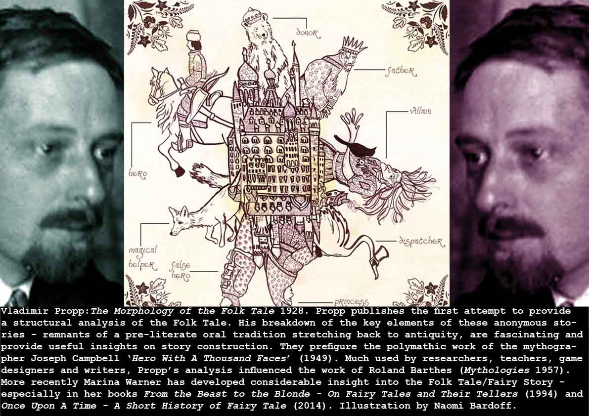
Vladimir Propp:The Morphology of the Folk Tale 1928
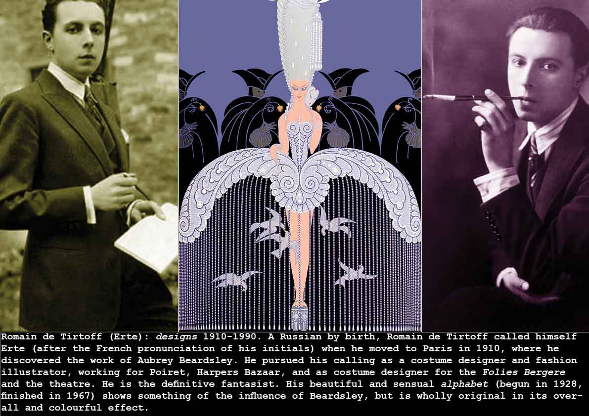
Romain de Tirtoff (Erte): designs 1910-1990
James Sibley Watson + Melville Webber: The Fall of the House of Usher 1928
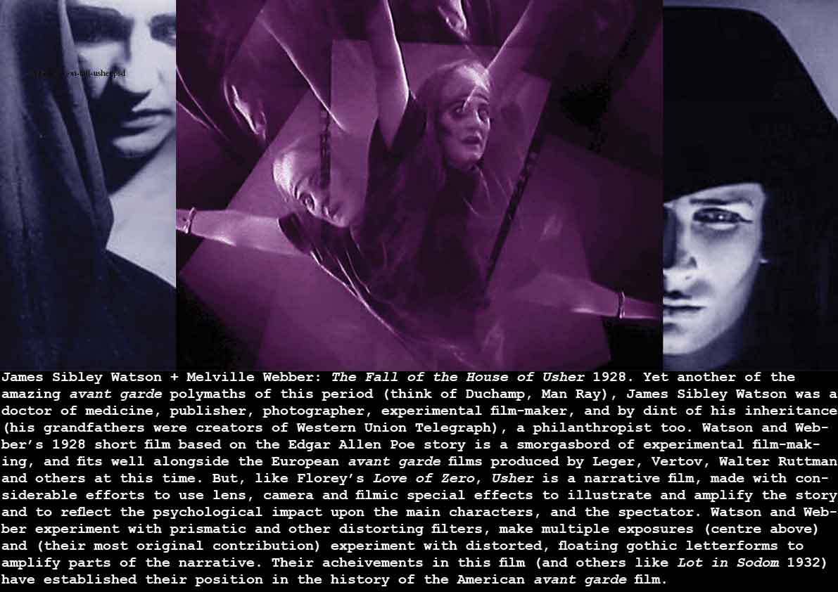
The extended vocabulary of film, introduced by experimentalists like Watson and Webber in the 1920s and 1930s, is now such a commonplace of the film-maker’s art as to be unremarkable. However if you try to squeeze your sensibility-awareness down into the spectrum of the average 1920s cinema audience, these films (this and shorts like Le Chien Andalou, Love of Zero, Ballet Mecanique, The Seashell and the Clergyman, Man with a Movie Camera, etc) were breaking entirely new ground, applying modernist creative methodologies to the art of film.
see the Kino Video DVD compilation: Avant Garde – Experimental Cinema in the 192-s and ’30s 2005
A.L. Rees: A History of Experimental Film and Video 2011
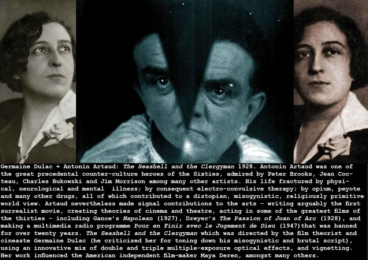
Germaine Dulac + Antonin Artaud: The Seashell and the Clergyman 1928
Claude Cahun: (L-R) Self-Portrait 1912, Untitled 1927, Self-Portrait 1929
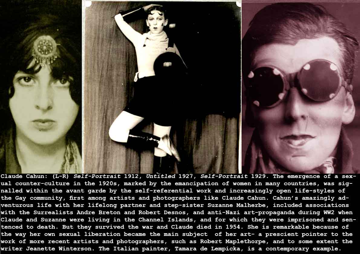
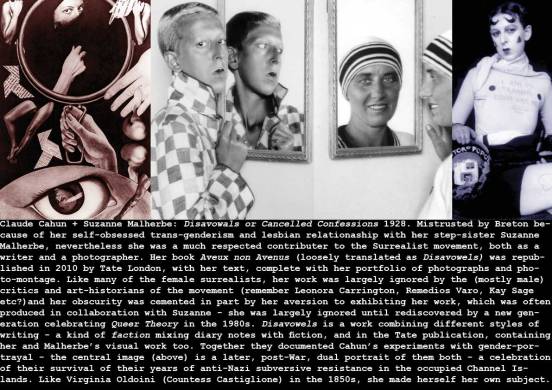
Claude Cahun + Suzanne Malherbe: Disavowals or Cancelled Confessions 1928
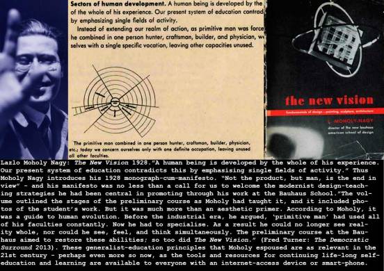
Lazlo Moholy Nagy: The New Vision 1928
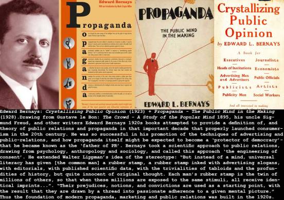
Edward Bernays: Crystallizing Public Opinion (1923) + Propaganda – The Public Mind in the Making (1928)
You can see that Bernays’ theories of propaganda follow Gustave Le Bon (and indeed Wilfred Trotter: Instincts of the Herd in Peace and War, 1916), and contain a message for ‘consumerist’ democracies as well as fascist dictatorships:
“In almost every act of our daily lives, whether in the sphere of politics or business, in our social conduct or our critical thinking, we are dominated by the relatively small number of persons…who understand the mental processes and social patterns of the masses. It is they who pull the wires which control the public mind.”
(from Bernays: Propaganda 1928)
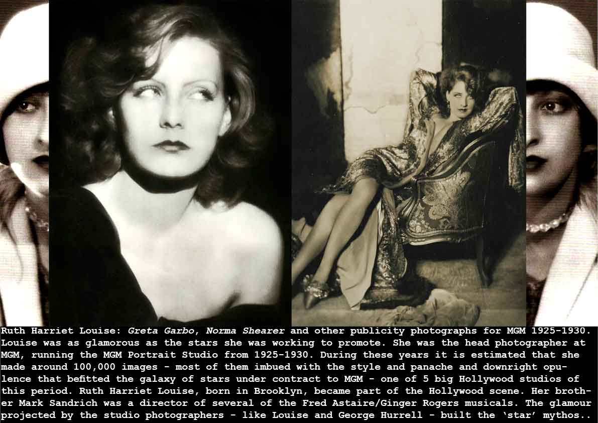
Ruth Harriet Louise: Greta Garbo, Norma Shearer and other publicity photographs for MGM 1925-1930
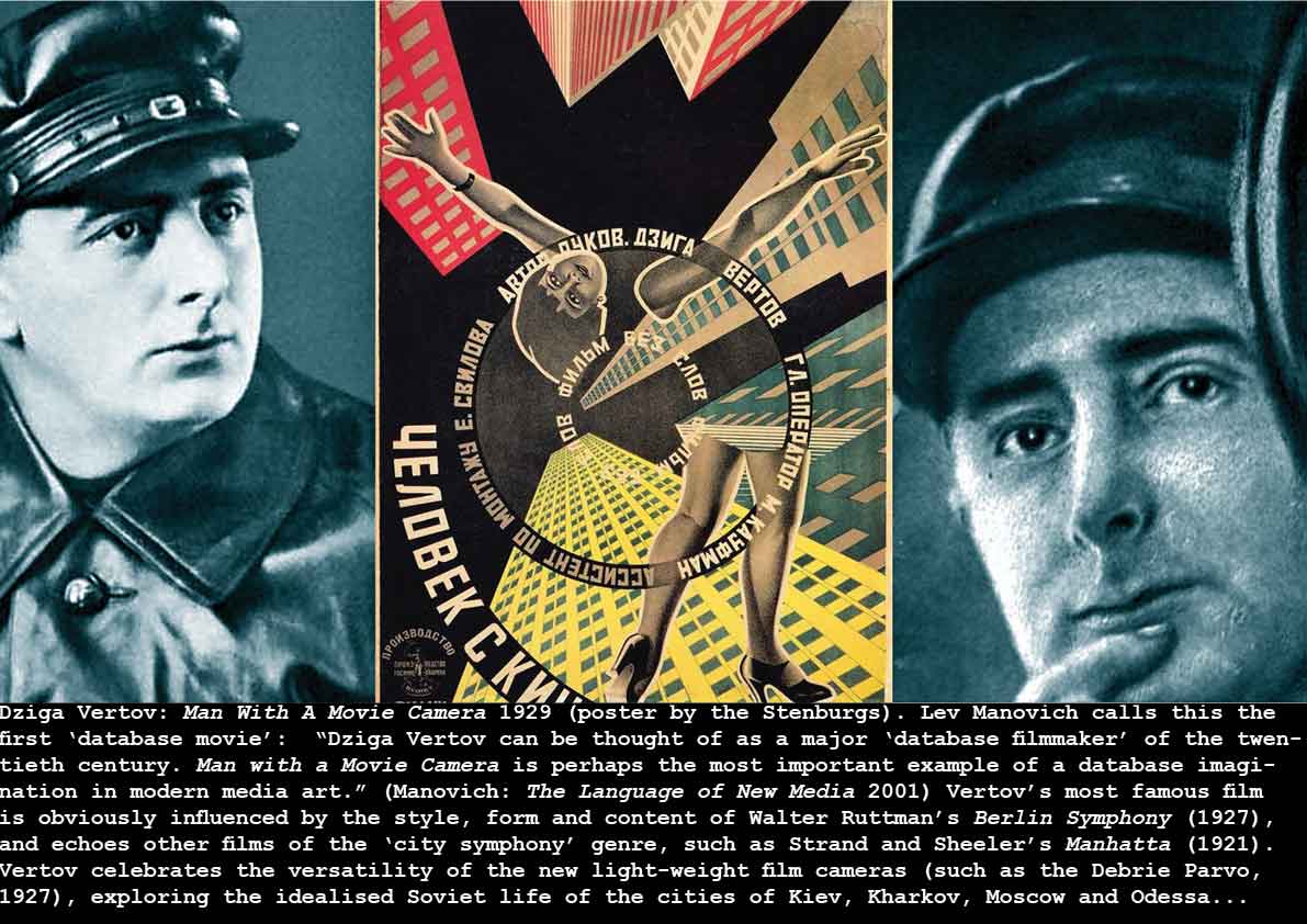
Dziga Vertov: Man With A Movie Camera 1929 (poster by the Stenburgs)
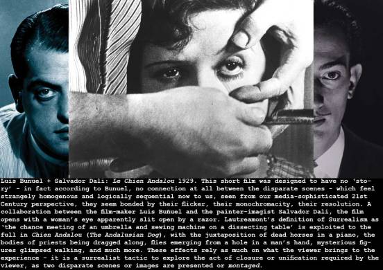
Luis Bunuel + Salvador Dali: Le Chien Andalou 1929
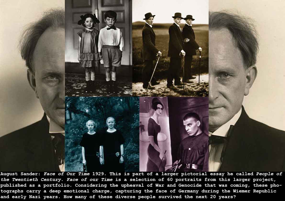
August Sander: Face of Our Time 1929
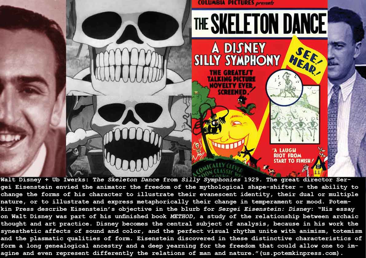
Walt Disney + Ub Iwerks: The Skeleton Dance from Silly Symphonies 1929
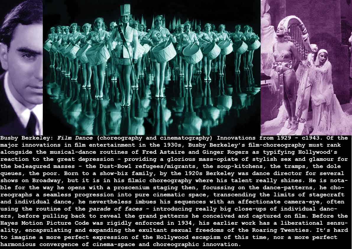
Busby Berkeley: Film Dance (choreography and cinematography) Innovations from 1929 – c1943
Aby Warburg: The Mnemosyne Atlas 1929
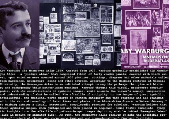
The Warburg Institute, (at https://warburg.library.cornell.edu/image-group/panel-b-introduction-1-3?sequence=944) have produced some interactive ‘pathways’ to take through samples of the Mnemosyne Atlas, indicating a mode of use that I’m sure Warburg would have loved – it is a logical and ergonomic extension of this idea – a project that Warburg left unfinished at his death in 1929. In this sense, Warburg was a visionary – providing a study-space that’s inspirational, that draws on interdisciplinary sources…
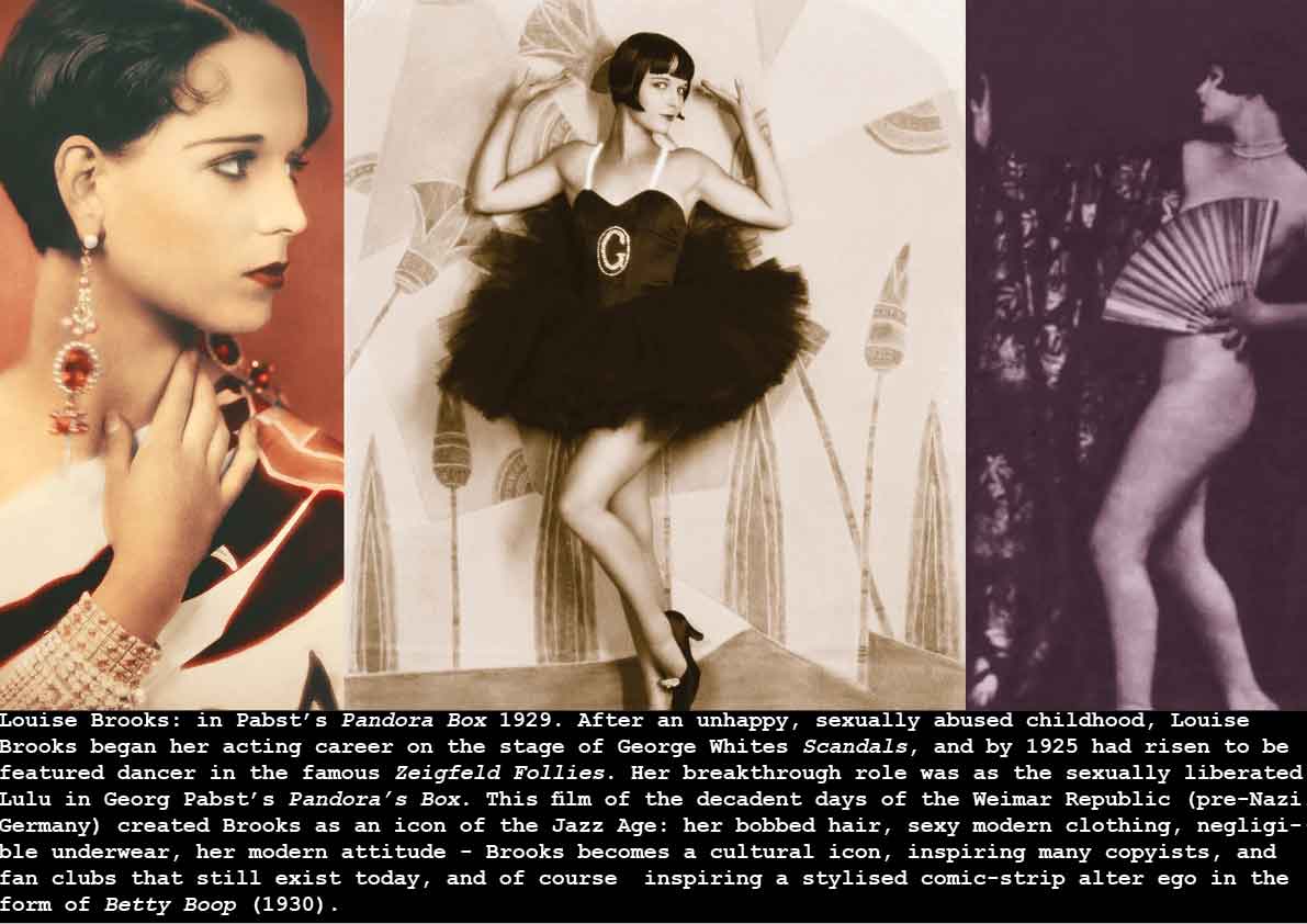
Louise Brooks: in Pabst’s Pandora Box 1929